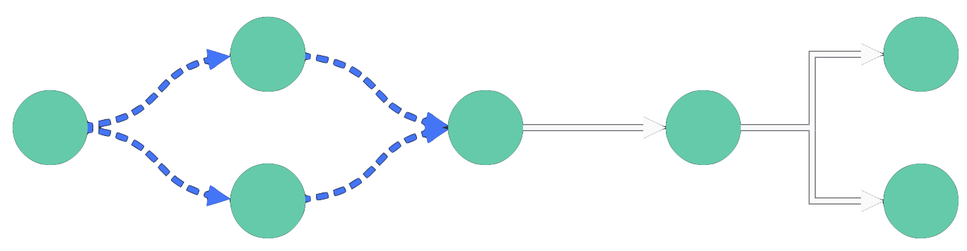
For example, you might have a chart with a sequential component using angled links, and want to show the relationship between that, and another set of nodes, using curved links, as shown.
ReGraph is a library of React components and analysis functions for client-side visualization of connected data.
You can try out ReGraph directly in your browser by opening a live code Playground and when you're ready, our tutorials can help you add ReGraph to your existing app or help you create a brand new ReGraph app.
ReGraph includes two visualization components - a chart to draw relationships between connected entities, and a time bar to represent events occurring over time:
import React from 'react';
import ReactDOM from 'react-dom';

import { Chart } from 'regraph';

export default function BasicChart() {
  const settings = {
    options: {
      navigation: false,
      overview: false,
      backgroundColor: 'rgb(61, 72, 82)',
    },
    onWheel: ({ preventDefault }) => {
      preventDefault();
    },
  };
  const items = {
    node1: {
      color: '#5fe3bf',
    },
    node2: {
      color: '#5fe3bf',
    },
    link1: {
      id1: 'node1',
      id2: 'node2',
      color: 'rgb(4, 129, 112)',
      width: 4,
    },
  };
  return <Chart items={items} {...settings} />;
}

ReactDOM.render(<BasicChart />, document.getElementById('app'));

import React from 'react';
import ReactDOM from 'react-dom';

import { TimeBar } from 'regraph';

export default function BasicTimeBar() {
  const items = {
    event1: {
      times: [
        {
          time: {
            start: Date.now() - 15000000,
          },
        },
      ],
    },
    event2: {
      times: [
        {
          time: {
            start: Date.now() - 10000000,
            end: Date.now() + 10000000,
          },
        },
      ],
    },
  };
  const settings = {
    options: {
      backgroundColor: 'rgb(81, 95, 108)',
      style: {
        color: 'rgb(45, 205, 168)',
        hoverColor: 'rgb(7, 156, 131)',
      },
      sliders: {
        color: 'rgba(36, 44, 50, 0.5)',
        lineColor: 'rgb(81, 95, 108)',
      },
      labels: {
        fontColor: 'rgb(123, 135, 147)',
      },
      scale: {
        hoverColor: 'rgb(81, 95, 108)',
      },
    },
    onWheel: ({ preventDefault }) => {
      preventDefault();
    },
  };

  return (
    <TimeBar
      items={items}
      {...settings}
      selection={{ event2: true }}
      selectionColor="rgb(242, 119, 110)"
    />
  );
}

ReactDOM.render(<BasicTimeBar />, document.getElementById('app'));
Download the latest version of ReGraph:
For Safari browsers,
hold the ⌥ Option key when pressing the Download button
to download the correct .tgz format.
Copy the ReGraph bundle into your project directory. Do not change the file name.
cd ~/path/to/project
cp ~/Downloads/regraph-5.10.2.tgz .
Install the bundle as a local package from inside your project directory using a package manager:
npm install file:regraph-5.10.2.tgzyarn add ./regraph-5.10.2.tgzpnpm install file:regraph-5.10.2.tgzNow you can import ReGraph into your project:
import React from 'react';
import { createRoot } from 'react-dom/client'; // enables concurrent rendering
import { Chart } from 'regraph';

const items = {
 node1: { label: { text: 'Hello World!' } }  // data in JSON where node1 is node id
};
const jsx = <Chart items={items}/>;
const container = document.getElementById('root');
const root = createRoot(container);
root.render(jsx);
If you don't have an existing project, you can create one with Vite by following the Vite Getting Started guide for your preferred package manager.
Alternatively, run the following quick start command to create a React Vite app:
npm create vite@latest my-regraph-app -- --template reactyarn create vite my-regraph-app --template reactpnpm create vite my-regraph-app --template reactIf you are prompted about any settings while the command is running, you can accept the default values for now.
Once this process has completed, start a development server:
cd my-regraph-app
npm install
npm run dev
cd my-regraph-app
yarn
yarn devcd my-regraph-app
pnpm install
pnpm run devBy default, Vite runs a development server at http://localhost:5173.
Next, download the latest version of ReGraph:
For Safari browsers,
hold the ⌥ Option key when pressing the Download button
to download the correct .tgz format.
Move the download into your new project's root folder. If you are on a UNIX-like operating system, you can do this from the terminal:
cp ~/Downloads/regraph-5.10.2.tgz .From your project's root folder, install the bundle as a local package:
npm install file:regraph-5.10.2.tgzyarn add ./regraph-5.10.2.tgzpnpm install file:regraph-5.10.2.tgzNext, open the App.jsx file in the src folder. This is where the component is declared. We will replace the boilerplate application with a ReGraph Chart component.
First, replace the import statements with an import statement for ReGraph:
import { Chart } from 'regraph';
And then replace the App() function with a new function:
function App() {
  return (
    // returns a div with a ReGraph Chart that fills the viewport
    <div style={{ height: '100vh', width: '100vw' }}>
      <Chart
        // a dictionary where each key is an item id
        // and each value is the item's definition
        items={{ node: { label: { text: 'Hello World!' } } }}/>
    </div>
  );
}
You should now see a ReGraph chart with a single node.

The chart sets its height and width to equal the size of its parent element, so any style should be set on the parent element.
Now that you have your first project, here's a few suggestions on where to go next if you're interested in...
To update to the latest version of ReGraph, or to update your license, you need to replace your existing regraph.tgz bundle with the latest version and add it to your project.
First, download the latest version of ReGraph:
For Safari browsers,
hold the ⌥ Option key when pressing the Download button
to download the correct .tgz format.
Next, copy the bundle into your project. Do not change the file name.
cd ~/path/to/project
cp ~/Downloads/regraph-5.10.2.tgz .
If you already have a bundle in your project, you should delete it now.
Finally, remove the old version and install the bundle again from inside your project's root folder with your package manager:
npm uninstall regraph
npm install file:regraph-5.10.2.tgz
yarn remove regraph
yarn add ./regraph-5.10.2.tgzpnpm remove regraph
pnpm install file:regraph-5.10.2.tgzTo verify the update was successful, see the header comments of node_modules/regraph/index.js, or ask the package manager which version was installed:
npm list regraphyarn list --pattern regraphpnpm list regraphIf you are upgrading ReGraph after your license or your evaluation version had expired but your chart still isn't displaying correctly after the upgrade, try clearing the package manager's cache and installing the package again:
npm cache clean --force
npm install file:regraph-5.10.2.tgz
yarn cache --clean
yarn add ./regraph-5.10.2.tgz# step not required for pnpmIf you need any help with updating please contact support.
To help accelerate the design and build of branded graph visualizations that fit seamlessly into your application UI, download our free Figma Design Kit.
ReGraph forms part of the front end of your application and is entirely divorced from any backend architecture. It is up to you how to pull data into your page and format it into ReGraph's object format.
ReGraph is typically kept in a stateful container within your application. This container is responsible for updating ReGraph's state and integrating it with the other components.
State can exist simply in the state of a component, or a store provided by a React Hook, or in a Redux store. ReGraph is agnostic to this and behaves well in each environment, as long as its props are set correctly. See Re-rendering in ReGraph for more details.
Examples in this page typically assume that state is held in a component and passed to ReGraph by returning JSX from the component, as shown in the example below:
// Import various dependencies into the environment
import React from 'react';
import { Chart } from 'regraph';
import { fetchData, convertToReGraphFormat } from './myapp/helpers';

// Define the component
function App() {
  // Initialize app state
  const [state, setState] = React.useState({ items: {} });

  React.useEffect(() {
    // Load data from a data source
    fetchData().then((data) => {
      const items = convertToReGraphFormat(data); // your own custom formatter

      // When data is ready, set it on the component's state
      setState({ items });
    })
  }, []);

  // Create a ReGraph chart and push data into it from state
  return <Chart items={state.items} />
}
Note that the ReGraph source code needs to be sufficiently obfuscated before your application is distributed.
The ReGraph chart is designed to visualize connected data sets. Although it can render a huge number of items, effective data visualization should aim to limit the amount of visible data. ReGraph comes loaded with features to filter and analyze your data. For examples, see our Graph Analysis stories.
The ReGraph time bar shows events over time. It can be used to filter items in a chart to events occurring within a specific time period, which provides an excellent way to reduce clutter in the chart. It can also highlight activity for a particular item.
ReGraph allows you to show a chart or time bar by describing its state with a series of objects. State can mean a number of things to ReGraph, including the data to render, the positions of nodes, layout and animation rules, viewport control and options. This state is passed to the component via props and will queue an animated redraw for the chart.
The full list of ReGraph props can be found in the API Reference.
Some state is controlled by ReGraph itself, for example when a layout is run and positions change, or when a user clicks on a node.
In these cases, state changes are published to your application via an onChange event handler.
You can hook to this to pass changes back to your application, for example to prevent the chart from moving during changes.
Data is loaded into ReGraph by passing a plain JavaScript object into the items prop. Each item can be
one of the following types:
Node: A single point or entity in the graph. Nodes typically render as circles, but can also be boxes.
Link: A connection between nodes. Links must have an id1 and id2 property.
Annotation: A note connected to item(s) in the chart. Annotations must have a subject property.
Times: Items with a times property represent a point in,
or period of, time. Times is only used by the time bar component.
Times can be added to nodes or links.
Each key of the items object is the id of an item, and its value
defines that item. To update an item, simply pass in a new object with updated values.
ReGraph relies on immutability to maintain state and understand when changes occur: see the Re-rendering in ReGraph section.
See the API Reference for a full guide to the available props and data formats.
Model Context Protocol (MCP) is an open-source standard to expose tools, data, or functionality to AI applications.
ReGraph MCP server enables AI agents in your code editor to access our APIs and docs and provides more accurate and relevant help when developing with ReGraph.
All Cambridge Intelligence products have MCP servers. You can use them individually or together when integrating multiple products from our suite.
MCP servers are compatible with different code editors thanks to the universal open-source standard. Generally, code editors have an MCP configuration file, often named mcp.json. Every MCP server is added to this config file as a new entry:
{
   "servers": {
      "regraph": {   // our ReGraph MCP server
           "url": "https://mcp.cambridge-intelligence.com/regraph",
          "type": "http"
      },
      "mapweave": {   // our MapWeave MCP server
          "url": "https://mcp.cambridge-intelligence.com/mapweave",
          "type": "http"
      },
      / ... /
   }
}
This section shows how to add MCP servers to selected code editors. If your code editor isn't here, check the official documentation for the exact location of the MCP config file.
First, install Claude Code globally in your environment:
npm install -g @anthropic-ai/claude-code
Next, add a new MCP server to Claude and name it:
claude mcp add --transport http my-regraph-mcp-server https://mcp.cambridge-intelligence.com/regraph
Finally, verify that the server is running:
claude mcp list
For details and troubleshooting, see Connect Claude Code to tools via MCP.
Create a config file .cursor/mcp.json in your project's root folder and add the MCP server:
{
   "mcpServers": {
      "regraph": {
          "command": "npx",
          "args": ["-y", "mcp-remote@latest", "https://mcp.cambridge-intelligence.com/regraph"]
      }
   }
}
"npx": Runs the server using npx tool by Node.js "-y": Confirms the installation"mcp-remote@latest", "https://mcp.cambridge-intelligence.com/regraph": Downloads the packageThis method downloads the MCP server as a package using mcp-remote because Cursor currently doesn't consistently support streamable http connections.
To verify the server is running, press Shift+Command+U (Mac) / Ctrl+Shift+U (Win) to open the Output panel. Select MCP Logs from the drop-down menu to view logs confirming that the server is connected.
For details and troubleshooting, see the Model Context Protocol (MCP) docs by Cursor.
To add an MCP server to JetBrains IDEs such as IntelliJ IDEA or WebStorm, use the latest version of the IDE and install the JetBrains AI Assistant plugin.
{
   "mcpServers": {
      "regraph": {
          "url": "https://mcp.cambridge-intelligence.com/regraph",
          "type": "http"
      }
   }
}
To verify the server is running, go to Help | Show Log in Explorer/Finder/Nautilus (depending on OS). The directory contains an mcp folder with a separate log file for each added MCP server.
For details and troubleshooting, see the Model Context Protocol (MCP) docs by JetBrains.
Make sure you are on the latest version of VS Code and have access to GitHub Copilot.
https://mcp.cambridge-intelligence.com/regraph
my-regraph-mcp-server
This creates an mcp.json file in the .vscode directory with the MCP server specified.
To verify the server is running, click the Extensions icon in the left navigation panel and find the MCP SERVERS - INSTALLED tab. Right-click on the server listed in this tab and select Show Output to view logs confirming that the server is connected.
For details and troubleshooting, see the Use MCP servers in VS Code docs by VS Code.
To help you get started, here are some example prompts to use for the MCP servers:
We collect a short list of key words from your prompts and the answers provided by the MCP server, and we analyze this data so we can continue improving our MCP server for a better developer experience. The format may look like this:
"query": "export chart to PNG image"
Chart items such as nodes, links and annotations support a wide variety of customization options to make them suit your application. To do this, set properties on the item definitions in the items prop.
When you select a node or a link (default by clicking), it is styled with a selection style. This style is set using the selection property.
import React from 'react';
import ReactDOM from 'react-dom';

import { Chart } from 'regraph';

export default function ItemGallery() {
  const nodeColor = 'rgb(241, 93, 91)';

  const labelStyle = {
    backgroundColor: 'rgba(0,0,0,0)',
    color: 'rgb(202, 209, 216)',
    position: 's',
  };

  const linkStyle = {
    color: 'rgb(221, 60, 60)',
    width: 4,
  };

  const items = {
    bordered: {
      color: nodeColor,
      label: [
        {
          ...labelStyle,
          text: 'bordered',
        },
      ],
      border: { color: 'rgb(221, 60, 60)' },
    },
    enlarged: {
      color: nodeColor,
      label: [
        {
          ...labelStyle,
          text: 'enlarged',
        },
      ],
      size: 1.5,
    },
    image: {
      color: nodeColor,
      label: [
        {
          ...labelStyle,
          text: 'Image',
        },
      ],
      shape: 'box',
      image: '/img/rg-logo-square.png',
      border: { color: 'rgb(221, 60, 60)' },
    },
    link1: {
      ...linkStyle,
      id1: 'bordered',
      id2: 'enlarged',
    },
    link2: {
      ...linkStyle,
      id1: 'enlarged',
      id2: 'image',
      end1: {
        arrow: true,
      },
    },
    link3: {
      ...linkStyle,
      id1: 'enlarged',
      id2: 'image',
      end2: {
        arrow: true,
      },
      width: 1,
    },
  };

  const positions = {
    bordered: {
      x: -120,
      y: 0,
    },
    enlarged: {
      x: 0,
      y: 0,
    },
    image: {
      x: 120,
      y: 0,
    },
  };

  const settings = {
    options: {
      navigation: false,
      overview: false,
      backgroundColor: 'rgb(61, 72, 82)',
    },
    onWheel: ({ preventDefault }) => {
      preventDefault();
    },
  };

  return <Chart items={items} positions={positions} {...settings} />;
}

ReactDOM.render(<ItemGallery />, document.getElementById('app'));
Explore various styles in the Node Gallery, Link Gallery and Advanced Annotation Gallery stories.
As well as customizing chart items, you can also specify various sub-items.
Sub-items are either decorations on chart items (such as labels or glyphs), or parts of chart items themselves (such as an annotation container). Sub-items can respond to events. The following sub-items can also have their own style rules:
The following example shows sub-items in action:
import React from 'react';
import ReactDOM from 'react-dom';

import { Chart } from 'regraph';

export default function SubItems() {
  const nodeColor = '#17BA99';

  const labelStyle = {
    backgroundColor: 'rgba(0, 0, 0, 0)',
    color: 'white',
  };

  const glyphStyle = {
    color: '#079C83',
    border: { color: '#8CEDD0', width: 2 },
  };

  const glyphLabelColor = 'white';

  const items = {
    node1: {
      color: nodeColor,
      label: {
        ...labelStyle,
        text: 'Halos',
      },
      halos: [
        {
          radius: 35,
          color: '#5FE3BF',
          width: 8,
        },
        {
          radius: 47,
          color: '#8CEDD0',
          width: 8,
        },
      ],
    },
    node2: {
      color: nodeColor,
      label: {
        ...labelStyle,
        text: 'Glyphs',
      },
      glyphs: [
        {
          ...glyphStyle,
          position: 'n',
          label: {
            color: glyphLabelColor,
            text: 'N',
          },
        },
        {
          ...glyphStyle,
          position: 's',
          label: {
            color: glyphLabelColor,
            text: 'S',
          },
        },
        {
          ...glyphStyle,
          position: 'e',
          label: {
            color: glyphLabelColor,
            text: 'E',
          },
        },
        {
          ...glyphStyle,
          position: 'w',
          label: {
            color: glyphLabelColor,
            text: 'W',
          },
        },
      ],
    },
    node3: {
      color: nodeColor,
      label: {
        ...labelStyle,
        text: 'Donuts',
      },
      donut: {
        border: {
          width: 2,
          color: '#3D4852',
        },
        segments: [
          {
            color: '#8BEED2',
            size: 1,
          },
          {
            color: '#8CEDD0',
            size: 1,
          },
          {
            color: '#5FE3BF',
            size: 1,
          },
        ],
      },
    },
  };

  const positions = {
    node1: { x: 0, y: -50 },
    node2: { x: -90, y: 50 },
    node3: { x: 90, y: 50 },
  };

  const settings = {
    options: {
      backgroundColor: 'rgb(61, 72, 82)',
      navigation: false,
      overview: false,
    },
    onWheel: ({ preventDefault }) => {
      preventDefault();
    },
  };

  return <Chart items={items} positions={positions} {...settings} />;
}

ReactDOM.render(<SubItems />, document.getElementById('app'));
For more details and a full list of sub-item types, see the Sub-item section in the API Reference.
Interaction styling is applied when an item or sub-item is interacted with, i.e. hovered or selected.
The styling changes back to the values defined in the items prop automatically once the interaction is finished.
This means that you don't need to manage item state when applying different styles for hovered or selected items.
To apply interaction styling, use the onItemInteraction event and pass the new styling to the event's setStyle function.
If you're using both onItemInteraction
and the selection
Chart option to style an item, only the styling specified for selection will be applied.
import React from 'react';
import ReactDOM from 'react-dom';

import { Chart } from 'regraph';

const GlyphHoverStyle = {
  color: '#f15d5b',
  border: { color: '#fff', width: 2 },
};

const ItemHoverStyle = {
  color: '#f15d5b',
  border: { color: '#fff', width: 3 },
};

export default function InteractionStyling() {
  const onItemInteractionHandler = ({ hovered, id, setStyle, subItem }) => {
    let newStyle = { glyphs: [] };
    if (hovered && subItem && subItem.type === 'glyph') {
      newStyle.glyphs[0] = GlyphHoverStyle;
    } else {
      newStyle = ItemHoverStyle;
    }

    setStyle({ [id]: newStyle });
  };

  const items = {
    node: {
      color: '#17BA99',
      border: { color: 'rgb(7, 156, 131)', width: 1 },
      size: 1.2,
      data: { type: 'node' },
      label: {},
      glyphs: [
        {
          color: '#079C83',
          border: { color: 'rgb(241, 93, 91)', width: 1 },
          size: 1.2,
          position: 'ne',
          label: {
            text: 'Glyph',
          },
        },
      ],
    },
  };

  const settings = {
    options: {
      backgroundColor: 'rgb(61, 72, 82)',
      hoverDelay: 0,
      navigation: false,
      overview: false,
      selection: false,
    },
    onWheel: ({ preventDefault }) => {
      preventDefault();
    },
  };

  return <Chart items={items} onItemInteraction={onItemInteractionHandler} {...settings} />;
}

ReactDOM.render(<InteractionStyling />, document.getElementById('app'));
Link shape refers to the shape of a link path, and helps highlight particular aspects of your data structure for different chart layouts and combo arrangements. Direct links are used by default, but you can change that at chart level using the layout linkShape option. You can then fine-tune the appearance of your chart by specifying a different link shape at combo level using the arrangement linkShape option. See Using a mixture of link shapes for information about how to use multiple link shapes.
Link shape summary:
direct | The default. Direct links are straight lines that run directly between nodes. Well-suited to charts that concentrate on overall connectivity using organic, lens or radial layouts. | 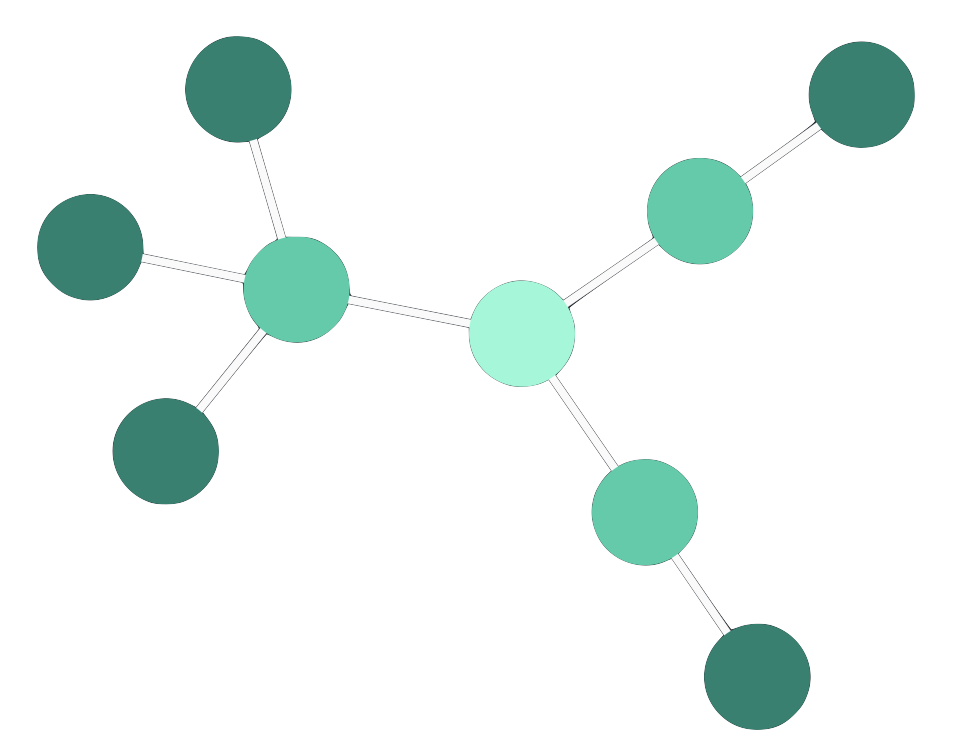 |
angled | Angled links provide an orthogonally branching shape between nodes in a hierarchical structure, aligned with layout orientation. Especially suited to sequential layouts. In beta from v5.1. Use priority links to highlight different paths, as shown in the Angled Links story. | Beta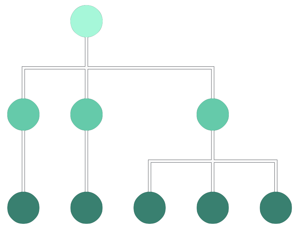 |
curved | Curved links follow a smooth path between nodes in different levels of a hierarchical structure, aligned with layout orientation. Useful for hierarchical data, especially sequential layouts. | 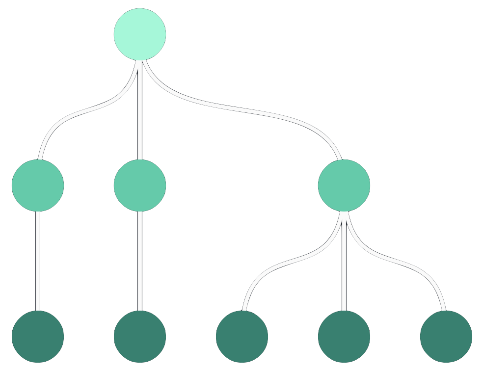 |
Leaflet Integration always uses direct links.
In addition to using an overall link shape for your chart layout, with perhaps another for combo arrangements, you can also specify the link shape for an individual link, which takes precedence.
Setting an individual link's linkShape property, specifies its shape, and the direction in which it connects to its end nodes. This can be useful to represent different types of relationship in your chart.
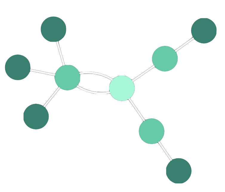
For example, you might have a chart with a sequential component using angled links, and want to show the relationship between that, and another set of nodes, using curved links, as shown.
Explore this further in the Mixed Link Shapes story.
By default ReGraph automatically spaces out multiple direct or curved links (as described in Link Shapes) running between two nodes by separating their midpoints. Direct links are separated to follow arcs, as shown, while curved links follow double curves.
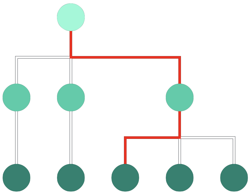
Angled links can't helpfully be separated this way, so to focus on a critical path through a chart using angled links, use priority links.
To help focus on a particular path through a dense and overlapping network of nodes and links, you can assign priority to particular links to show them clearly, and in front of other links. This can be useful when using angled links, as illustrated, which can overlap each other.
Explore the use of link priority, used to highlight the attack path in the Cloud Security showcase.
There are various reasons why your charts may need a custom node design:
Below are some examples of the ReGraph API for advanced node styling:
shape: Sets width and height to get rectangular nodes.radius: Sets corner radius to node border.label: Accepts an array of one or more objects to create multiple labels with a large number of customizable properties
such as image, position, border, margin, padding or textAlignment. This feature is currently in beta.
See the Node Label API for details.If your nodes contain images or font icons, you can control their scale and position using imageAlignment.
For more examples, see also the Node Gallery and Advanced Node Gallery stories.
import React from 'react';
import ReactDOM from 'react-dom';

import { Chart } from 'regraph';

export default function AdvancedStyling() {
  const shape = {
    height: 80,
    width: 'auto',
    minWidth: 250,
  };

  const nodeColor = '#17BA99';
  const textColor = '#fff';
  const alertColor = '#fedd03';
  const clearBackground = 'rgba(0, 0, 0, 0)';

  const border = {
    color: alertColor,
    radius: 15,
  };

  const items = {
    node1: {
      shape,
      color: nodeColor,
      border,
      label: [
        {
          fontIcon: {
            fontFamily: 'Font Awesome 5 Free',
            text: 'fas fa-exclamation-triangle',
          },
          position: {
            vertical: 'top',
            horizontal: 'right',
          },
          fontSize: 30,
          color: alertColor,
          backgroundColor: clearBackground,
          margin: '3 3 0 0',
        },
        {
          fontIcon: {
            fontFamily: 'Font Awesome 5 Free',
            text: 'fas fa-desktop',
          },
          position: {
            vertical: 'middle',
            horizontal: 'left',
          },
          fontSize: 70,
          color: textColor,
          backgroundColor: clearBackground,
          margin: '0 0 0 6',
        },
        {
          text: 'Service AB',
          position: {
            vertical: 20,
            horizontal: 60,
          },
          fontSize: 25,
          color: textColor,
          bold: true,
          backgroundColor: clearBackground,
          margin: '0 0 0 10',
        },
        {
          text: 'Status: ',
          position: {
            vertical: 45,
            horizontal: 60,
          },
          color: textColor,
          bold: true,
          backgroundColor: clearBackground,
          margin: '0 0 0 10',
        },
        {
          text: 'Storage at 90%',
          position: {
            vertical: 'inherit',
          },
          color: textColor,
          backgroundColor: clearBackground,
        },
      ],
    },
  };

  const settings = {
    options: {
      iconFontFamily: 'Font Awesome 5 Free',
      backgroundColor: 'rgb(61, 72, 82)',
      navigation: false,
      overview: false,
    },
    onWheel: ({ preventDefault }) => {
      preventDefault();
    },
  };

  return <Chart items={items} {...settings} />;
}

const FontReadyChart = React.lazy(() =>
  document.fonts.load("24px 'Font Awesome 5 Free'").then(() => ({
    default: AdvancedStyling,
  })),
);

export function AdvancedStylingDemo() {
  return (
    <React.Suspense fallback="">
      <FontReadyChart />
    </React.Suspense>
  );
}

ReactDOM.render(<AdvancedStylingDemo />, document.getElementById('app'));
Labels are anchored to nodes from the outside or from the inside.
The position property accepts a string compass value to set the label outside the node, or an object with
vertical and/or horizontal properties to set the label inside the node.
Set the position of images and font icons within node labels using position and margin. You can also control the scale of font icons using fontSize.
import React from 'react';
import ReactDOM from 'react-dom';

import { Chart } from 'regraph';

export default function NodeStyling() {
  const nodeColor = '#17BA99';
  const shape = { height: 250, width: 550 };
  const textColor = '#fff';
  const border = { radius: 5 };

  const insideLabelStyle = {
    backgroundColor: 'rgb(7, 156, 131)',
    color: textColor,
    fontSize: 25,
    border: {
      color: 'rgb(4, 129, 112)',
      radius: 5,
    },
  };
  const outsideLabelStyle = {
    backgroundColor: 'rgb(241, 93, 91)',
    color: textColor,
    fontSize: 25,
    border: {
      color: 'rgb(221, 60, 60)',
      radius: 5,
    },
  };

  const items = {
    node1: {
      shape: shape,
      color: nodeColor,
      border: border,
      label: [
        {
          text: 'n',
          position: 'n',
          ...outsideLabelStyle,
        },
        {
          text: 's',
          position: 's',
          ...outsideLabelStyle,
        },
        {
          text: 'e',
          position: 'e',
          ...outsideLabelStyle,
        },
        {
          text: 'w',
          position: 'w',
          ...outsideLabelStyle,
        },
        {
          text: 'ne',
          position: 'ne',
          ...outsideLabelStyle,
        },
        {
          text: 'nw',
          position: 'nw',
          ...outsideLabelStyle,
        },
        {
          text: 'se',
          position: 'se',
          ...outsideLabelStyle,
        },
        {
          text: 'sw',
          position: 'sw',
          ...outsideLabelStyle,
        },
        {
          text: '50, 50 world units',
          position: { vertical: 50, horizontal: 50 }, // world units
          ...insideLabelStyle,
        },
        {
          text: '(top, left)',
          position: { vertical: 'top', horizontal: 'left' },
          ...insideLabelStyle,
        },
        {
          text: '(top, right)',
          position: { vertical: 'top', horizontal: 'right' },
          ...insideLabelStyle,
        },
        {
          text: '(top, center)',
          position: { vertical: 'top', horizontal: 'center' },
          ...insideLabelStyle,
        },
        {
          text: '(middle, left)',
          position: { vertical: 'middle', horizontal: 'left' },
          ...insideLabelStyle,
        },
        {
          text: '(middle, center)',
          position: { vertical: 'middle', horizontal: 'center' },
          ...insideLabelStyle,
        },
        {
          text: '(middle, right)',
          position: { vertical: 'middle', horizontal: 'right' },
          ...insideLabelStyle,
        },
        {
          text: '(bottom, left)',
          position: { vertical: 'bottom', horizontal: 'left' },
          ...insideLabelStyle,
        },
        {
          text: '(bottom, center)',
          position: { vertical: 'bottom', horizontal: 'center' },
          ...insideLabelStyle,
        },
        {
          text: '(bottom, right)',
          position: { vertical: 'bottom', horizontal: 'right' },
          ...insideLabelStyle,
        },
      ],
    },
  };

  const settings = {
    options: {
      backgroundColor: 'rgb(61, 72, 82)',
      navigation: false,
      overview: false,
    },
    onWheel: ({ preventDefault }) => {
      preventDefault();
    },
  };

  return <Chart items={items} {...settings} />;
}

ReactDOM.render(<NodeStyling />, document.getElementById('app'));
By default, multiple labels on a node are stacked vertically from the top.
There are two ways how to position multiple labels on the same line using the vertical option of position:
vertical position setvertical position setimport React from 'react'; import ReactDOM from 'react-dom'; import { Chart } from 'regraph'; export default function InlineLabels() { const nodeColor = '#17BA99'; const shape = { height: 180, width: 350 }; const textColor = '#fff'; const border = { radius: 5 }; const precedingLabelStyle = { backgroundColor: 'rgb(7, 156, 131)', color: textColor, fontSize: 25, border: { color: 'rgb(4, 129, 112)', radius: 5, }, }; const followingLabelStyle = { backgroundColor: 'rgb(241, 93, 91)', color: textColor, fontSize: 25, border: { color: 'rgb(221, 60, 60)', radius: 5, }, }; const items = { node1: { shape: shape, color: nodeColor, border: border, label: [ { text: 'no position', ...precedingLabelStyle, }, { position: { vertical: 'inherit' }, text: 'inline by inherit', ...followingLabelStyle, }, { position: { vertical: 'bottom' }, text: 'vertical position', ...precedingLabelStyle, }, { position: { vertical: 'bottom' }, text: 'inline by vertical position', ...followingLabelStyle, }, ], }, }; const settings = { options: { backgroundColor: 'rgb(61, 72, 82)', navigation: false, overview: false, }, onWheel: ({ preventDefault }) => { preventDefault(); }, }; return <Chart items={items} {...settings} />; } ReactDOM.render(<InlineLabels />, document.getElementById('app'));
A label can either contain an image or text-based information such as text or a font icon.
Image labels have image set, and can be sized by specifying both maxWidth and maxHeight.
You can also specify border and position them using margin and position, but other label settings are ignored.
Labels containing text or a font icon are sized, by default, to fit the content that's inside. In this case the ReGraph API lets you modify the label size and also customize the content inside:
minWidth, minHeight: Set custom label size.textAlignment: Sets the alignment of content inside a labelfontSize:'auto': Scales the font to any label size and zoom level.textWrap:'normal': Wraps the content on whitespace.maxWidth, maxHeight: Controls maximum size when text wrapping or automatic font sizing are used.import React from 'react'; import ReactDOM from 'react-dom'; import { Chart } from 'regraph'; export default function LabelSizing() { const nodeColor = '#17BA99'; const shape = { height: 180, width: 350 }; const textColor = '#fff'; const border = { radius: 5 }; const labelStyle1 = { backgroundColor: 'rgb(7, 156, 131)', color: textColor, border: { color: 'rgb(4, 129, 112)', radius: 5, }, }; const labelStyle2 = { backgroundColor: 'rgb(241, 93, 91)', color: textColor, border: { color: 'rgb(221, 60, 60)', radius: 5, }, }; const items = { node1: { shape: shape, color: nodeColor, border: border, label: [ { text: 'Default size label', position: { vertical: 'top' }, margin: { bottom: 5 }, ...labelStyle1, }, { text: 'Custom size and text alignment', minWidth: 300, minHeight: 40, textAlignment: { horizontal: 'right', vertical: 'bottom', }, margin: { bottom: 5 }, ...labelStyle2, }, { text: 'Automatic font sizing', fontSize: 'auto', margin: { bottom: 5 }, ...labelStyle1, }, { text: 'Max width, wrapped text, auto font size', textWrap: 'normal', fontSize: 'auto', maxWidth: 100, ...labelStyle2, }, ], }, }; const settings = { options: { backgroundColor: 'rgb(61, 72, 82)', navigation: false, overview: false, }, onWheel: ({ preventDefault }) => { preventDefault(); }, }; return <Chart items={items} {...settings} />; } ReactDOM.render(<LabelSizing />, document.getElementById('app'));
You can set margin and padding to fine-tune label spacing and position:
margin by setting the distance between the label
edge and either another label edge, or its parent node edge. This API behaves like, and can be set similarly
to, W3C CSS margin.
padding property which is specified, and behaves like,
W3C CSS padding. This doesn't apply to image labels because the image always fills the label.ReGraph uses a layout algorithm to determine where to position nodes on the Chart.
Layouts in ReGraph are designed to help you understand the relationships between nodes. Generally, connected items will be positioned close to each other, with more highly connected items nearer the center of the chart.
Each of ReGraph's layouts use different rules to position nodes, offering a range of options suited to different data sets.
See the Layouts story to compare the different layouts available.
import React from 'react';
import ReactDOM from 'react-dom';
import _ from 'lodash';
import { Chart } from 'regraph';

function generateData(count = 20) {
  const items = {};
  for (let i = 0; i < count; i += 1) {
    items[i] = {
      color: '#5fe3bf',
    };
  }
  for (let i = 0; i < 30; i += 1) {
    const a = i < count ? i : _.random(0, count - 1);
    let b;
    do {
      b = _.random(0, count - 1);
    } while (a === b);
    const id = [a, b].sort().join('-');
    items[id] = {
      id1: a,
      id2: b,
      color: 'rgb(4, 129, 112)',
      width: 4,
    };
  }
  return items;
}

export default function SimpleLayout() {
  const data = generateData();

  const settings = {
    options: {
      navigation: false,
      overview: false,
      backgroundColor: 'rgb(61, 72, 82)',
    },
    onWheel: ({ preventDefault }) => {
      preventDefault();
    },
  };

  return (
    <Chart
      items={data}
      layout={{
        name: 'organic',
      }}
      {...settings}
    />
  );
}

ReactDOM.render(<SimpleLayout />, document.getElementById('app'));
To set a layout, or to re-run a layout on existing data, pass an object to the layout
prop on the Chart with the name of the layout, along with any required options. For more
information, see the API Reference.
There are a variety of layout options available to customize your layouts.
After a layout has run and positions have been calculated, ReGraph will publish the new positions
to the onChange handler. Note that the onChange handler is also invoked when the
user drags an item.
You can manually control the chart by setting the positions prop. This will prevent ReGraph's built-in layouts from running. Instead, ReGraph will animate items into position for you. You can use this to:
onChange event into the positions prop to prevent movement during changes as seen in the
Filtering Data story.import React from 'react'; import ReactDOM from 'react-dom'; import _ from 'lodash'; import { Chart } from 'regraph'; function generateData(count = 20) { const items = {}; for (let i = 0; i < count; i += 1) { items[i] = { color: '#5fe3bf', }; } for (let i = 0; i < 30; i += 1) { const a = i < count ? i : _.random(0, count - 1); let b; do { b = _.random(0, count - 1); } while (a === b); const id = [a, b].sort().join('-'); items[id] = { id1: a, id2: b, width: 4, color: 'rgb(4, 129, 112)', }; } return items; } function isNode(item) { return !item.id1 && !item.id2; } export default function CustomLayout() { const data = generateData(); // Calculate a simple grid layout by setting // the x/y position of each node const positions = {}; let x = 0; let y = 0; let cols = 0; _.each(data, (item, id) => { if (isNode(item)) { cols += 1; positions[id] = { x, y, }; if (cols % 5 === 0) { y += 90; x = 0; } else { x += 90; } } }); const settings = { options: { navigation: false, overview: false, backgroundColor: 'rgb(61, 72, 82)', }, onWheel: ({ preventDefault }) => { preventDefault(); }, }; // Passing a new view object will tell ReGraph to zoom // to fit all items after the layout has run const view = {}; return <Chart items={data} positions={positions} view={view} {...settings} />; } ReactDOM.render(<CustomLayout />, document.getElementById('app'));
You can see examples of all our layouts in our Layouts story.
Organic is a force-directed layout, making links similar lengths and reducing node and edge overlaps as they distribute items evenly across the chart.
Organic is the default layout in ReGraph. It is suitable for any type or size of data and it's particularly useful for finding patterns and symmetries.
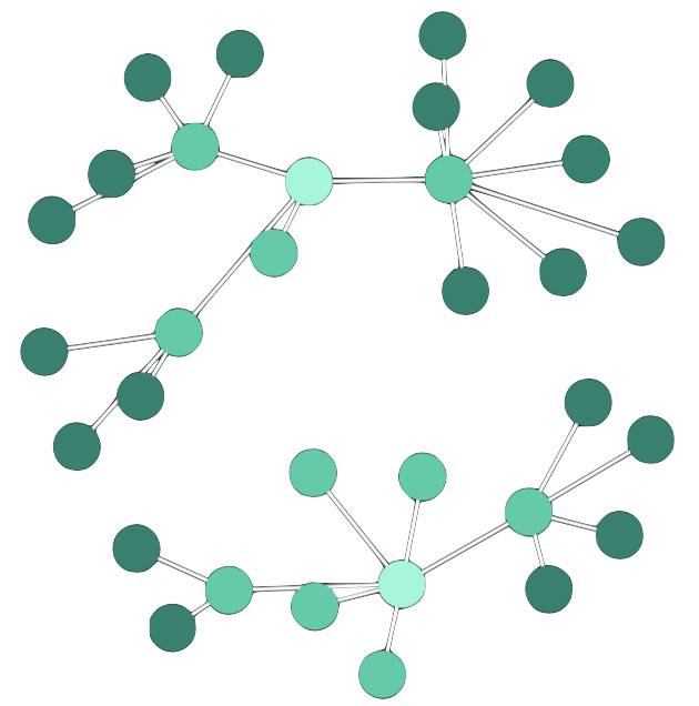
The structural layout functions in a similar manner to a force-directed layout, but it groups together nodes with the same neighboring nodes. This makes it easier to see the general organization of a network.
By giving you an overview of the clusters within a network, the structural layout allows you to see groupings and patterns without the need to focus on any one element.
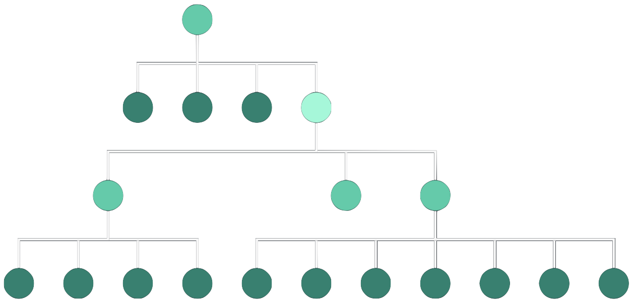
The sequential layout is useful for displaying data with a clear sequence of links between distinct levels of nodes. It minimizes link crossings and makes efficient use of space, and is particularly well-suited to using an angled link shape, as shown.
Sequential automatically places nodes according to the specified orientation, and the direction of arrows on links. You can also customize the position of nodes using the level or top options, and refine the ordering in each level using orderBy.
When space is at a premium, you can use packing, stretch and stretchtype. You can also stack nodes with identical connections into grids using stacking, as shown in our Navigating Large Hierarchies story.
The radial layout arranges nodes in concentric circles around a selected subject in a radial tree. Each ‘generation’ of nodes becomes a new ring surrounding the previous generations.
This layout is a great option when dealing with networks with a large number of child nodes compared to the number of parents as it makes a good use of any available space.
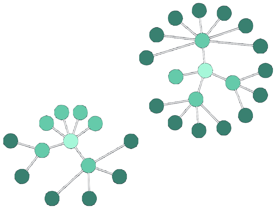
The lens layout pushes highly-connected nodes into the center, and forces less connected nodes outwards. Due to its circular arrangement, the lens layout makes good use of the available space and generally creates networks that are denser than other layouts.
Lens is the default layout for arranging items inside open combos, but you can also use the concentric arrangement.
There are two ways of representing coordinates on the chart.
World Coordinates represent an absolute position within the chart, where 0, 0 is the center of the chart. They correspond exactly to the positions of a node.
When integrating ReGraph with Leaflet, world coordinates are represented as lng, lat rather than x, y positions.
View Coordinates represent a pixel position relative to the viewport, where 0, 0 is the top-left corner of the view.
The x, y position of an event, such as onClick, is reported in view coordinates.
View coordinates change whenever the user pans the view.
To convert between world and view coordinates, you can use the viewCoordinates and worldCoordinates instance methods.
import React from 'react';
import ReactDOM from 'react-dom';

import { Chart } from 'regraph';

import 'leaflet/dist/leaflet';
import 'leaflet/dist/leaflet.css';

const data = {
  a: {
    color: '#5fe3bf',
    label: {
      text: 'a',
      color: 'rgb(61, 72, 82)',
      backgroundColor: 'rgba(0,0,0,0)',
    },
    coordinates: { lat: 33.942536, lng: -118.408075 },
  },
  b: {
    color: '#5fe3bf',
    label: {
      text: 'b',
      color: 'rgb(61, 72, 82)',
      backgroundColor: 'rgba(0,0,0,0)',
    },
    coordinates: { lat: 32.847111, lng: -96.851778 },
  },
  c: {
    color: '#5fe3bf',
    label: {
      text: 'c',
      color: 'rgb(61, 72, 82)',
      backgroundColor: 'rgba(0,0,0,0)',
    },
    coordinates: { lat: 40.777245, lng: -73.872608 },
  },
  d: {
    color: '#5fe3bf',
    label: {
      text: 'd',
      color: 'rgb(61, 72, 82)',
      backgroundColor: 'rgba(0,0,0,0)',
    },
    coordinates: { lat: 47.449, lng: -122.309306 },
  },
};

const defaultState = {
  selected: '',
  view: ' -, -',
  world: ' -, -',
};

export default function Coordinates() {
  const [positions, setPositions] = React.useState({});
  const [state, setState] = React.useState({
    ...defaultState,
    map: false,
    layout: { packing: 'rectangle' },
  });
  const chartRef = React.createRef(null);

  const onChangeHandler = (change) => {
    const { selected } = state;
    if (change.view) {
      handleUpdate(selected);
    }
    if (change.selection) {
      handleUpdate(Object.keys(change.selection)[0]);
    }
    if (change.positions) {
      setPositions(change.positions);
      handleUpdate(selected);
    }
  };

  const handleUpdate = (id) => {
    setState((current) => {
      const { map } = current;
      const update = { ...defaultState, map, selected: id };
      if (id) {
        let worldx;
        let worldy;
        if (map) {
          const { lng, lat } = data[id].coordinates;
          worldx = lng;
          worldy = lat;
        } else {
          const { x, y } = positions[id];
          worldx = x;
          worldy = y;
        }
        const { x: viewx, y: viewy } = chartRef.current.viewCoordinates(worldx, worldy);
        update.world = ` ${Math.round(worldx)}, ${Math.round(worldy)}`;
        update.view = ` ${Math.round(viewx)}, ${Math.round(viewy)}`;
      }
      return update;
    });
  };

  const { view, world, map, layout } = state;
  const settings = {
    options: {
      navigation: false,
      overview: false,
      backgroundColor: 'rgb(61, 72, 82)',
    },
    onWheel: ({ preventDefault }) => {
      preventDefault();
    },
  };
  const panelStyle = {
    position: 'absolute',
    right: '0',
    bottom: '0',
    backgroundColor: 'hsl(211, 12%, 43%)',
    margin: '8px',
    padding: '8px 12px',
    zIndex: '1001',
    color: 'hsl(210, 16%, 82%)',
  };
  const labelStyle = {
    position: 'absolute',
    left: '0',
    top: '0',
    backgroundColor: 'hsl(211, 12%, 43%)',
    margin: '8px',
    padding: '8px 12px',
    zIndex: '1001',
    color: 'hsl(210, 16%, 82%)',
  };
  const inputStyle = {
    width: 'auto',
  };
  return (
    <div style={{ position: 'relative', height: '99%' }}>
      <Chart
        items={data}
        ref={chartRef}
        onChange={(evt) => {
          onChangeHandler(evt);
        }}
        map={map}
        layout={layout}
        {...settings}
      />
      <label style={labelStyle}>
        <input
          type="checkbox"
          checked={map}
          style={inputStyle}
          onChange={() =>
            setState((current) => {
              return { ...current, map: !map };
            })
          }
        />
        Show Map
      </label>
      <div style={panelStyle}>
        <b>Coordinates</b>
        <div>
          View (x/y):
          {view}
        </div>
        <div>
          World ({map ? 'lng/lat' : 'x/y'}):
          {world}
        </div>
      </div>
    </div>
  );
}

ReactDOM.render(<Coordinates />, document.getElementById('app'));
State management in ReGraph relies on immutability, a concept where a prop cannot be changed (mutated) directly once it's created, but it can be updated by replacing it with a new prop. On every render, ReGraph uses referential equality to decide whether any props have changed.
Whenever a new object is passed as a prop, ReGraph assumes something has changed and performs a re-render. If the same object is passed, ReGraph assumes nothing has changed. This is why ReGraph can quickly and efficiently respond to re-renders even in very large datasets.
To prevent unnecessary re-renders, applications must be disciplined in how props are updated.
For example, passing a new object with identical property values into
the layout prop will trigger a re-render that may change the positions of nodes.
If you want to change a sub-property on a prop that's an object (e.g. the items prop or others),
you need to create a whole new object to make sure that ReGraph performs a re-render.
Consider the following object in the items prop:
items: {
  n1: {
    label: {
      color: 'blue', // <-- User changes a node's label color
      text: 'node 1'
    }
  },
  n2: {
    label: {
      text: 'node 2'
    }
  }
}
Let's say we change the n1's label.color property. If we simply
mutate the n1 object and pass it into the items prop,
the change won't be recognized and our chart will stay the same.
To correctly render the change, we have to create new objects for items and n1,
and set a new value for color.
You can see the properties that need to be re‑created marked with a star below:
items*: {
  n1*: {
    label*: {
      color*: 'red',
      text: 'node1'
    }
  },
  n2: {
    label: {
      text: 'node 2'
    }
  }
}
Deep cloning creates a copy of all the object values, and all the values of all the nested objects within it. In comparison, shallow cloning would create copies of primitive values, but objects wouldn't be copied, only referenced, which would not be recognized during a re-render in ReGraph.
Let's use the example above to illustrate the difference between the two cloning techniques. You may choose to use object destructuring to create a new object that you can modify and pass back to ReGraph:
const shallowClone={...items}
shallowClone.a.color='red'
setItems(shallowClone) // doesn't work
This doesn't work as shallowClone.a equals items.a.
The shallowClone.a is just a reference to items.a
and ReGraph decides not to do a re‑render as, apparently, nothing has changed.
This is what you would need to do instead:
const deepClone = window.structuredClone(items)
deepClone.a.color= 'red'
setItems(deepClone) // works
This does work as deepClone.a does not equal items.a and ReGraph will re‑render.
See this playground
that shows both techniques.
Using object destructuring is possible, but you need to make sure that you don't accidentally pass any references to old objects. Here is an example of how to successfully do this:
// Clone the items object before making any changes
const newItems = Object.assign({}, this.state.items);

// Deep clone and update the item you want to change.
// If you're using spread operator, access nested properties
// to deep clone nested changes as well
const newItem = Object.assign({}, newItems.n1, {
  label: {
    ...newItems.n1.label,
    color: 'red'
  }
});

// Write the change back to the newItems object
newItems.n1 = newItem;

// Update app state and trigger a re-render
this.setState({ items: newItems });
Using deep cloning and immutability in your application code provides better performance, results in fewer unexpected side-effects, and lets you rewind or undo user actions. We use these patterns throughout our stories.
When you pass a new state to the chart, ReGraph will calculate any differences between the new and existing states and animate the changes. The result is new nodes moving smoothly in and out of the chart from sensible origins, and layouts and property changes animating to let the end user follow the changes on-screen.
On any given update, ReGraph decides what animations are required and builds a queue of changes. It will then animate those changes in series until the Chart is in the right place. If state changes occur during animation, ReGraph will simply add more changes to the animation queue.
Animation should be switched off during drag events to ensure the drag is able to complete before any associated animations are run; see the Combos Drag and Drop story.
State changes are often complex and so to effectively manage them ReGraph animates in a particular order:
To control the order of animations, it may be necessary to queue multiple state changes.
You can control the speed of animation via the animation prop. Passing a time value
tells ReGraph how long it should take to animate each state update (in milliseconds). This time
will be shared by whatever animations are required. So if ReGraph has 1000ms to animate new items
being loaded into the chart, a layout which repositions nodes, and a change to node size, then
each animation will run in about a third of a second.
The example below uses setInterval to add a new item to the chart every two seconds,
triggering an animated layout.
import React, { useState, useEffect } from 'react';
import ReactDOM from 'react-dom';

import { Chart } from 'regraph';

const nodes = {
  center: {
    color: 'rgb(241, 93, 91)',
  },
};
const links = {};
for (let i = 1; i < 9; i += 1) {
  nodes[i] = {
    color: '#5fe3bf',
  };
  links[`link-${i}`] = {
    id1: 'center',
    id2: i,
    width: 3,
    end1: {
      color: 'rgb(241, 93, 91)',
    },
    end2: {
      color: '#5fe3bf',
    },
  };
}

export default function Animation() {
  const [state, setState] = useState({
    step: 9,
    items: {},
  });

  // configure animation setup and cleanup
  useEffect(() => {
    const updateNodes = () => {
      setState((current) => {
        if (current.step > 8) {
          const initial = {
            center: {
              ...nodes.center,
            },
            ...links,
          };
          return {
            step: 1,
            items: initial,
          };
        }
        const update = { ...current.items };
        update[current.step] = nodes[current.step];
        return {
          step: current.step + 1,
          items: update,
        };
      });
    };
    const animLoop = setInterval(updateNodes, 2000);
    return () => {
      clearInterval(animLoop);
    };
  }, []);

  const onWheelHandler = ({ preventDefault }) => {
    preventDefault();
  };

  const { items } = state;
  const animation = {
    time: 1000,
  };
  return (
    <Chart
      items={items}
      animation={animation}
      layout={{
        name: 'organic',
        fixed: ['center'],
      }}
      onWheel={onWheelHandler}
      options={{
        navigation: false,
        overview: false,
        backgroundColor: 'rgb(61, 72, 82)',
      }}
    />
  );
}

ReactDOM.render(<Animation />, document.getElementById('app'));
ReGraph comes with a number of default behaviors built in to respond to common user gestures. For example, clicking on a node or a link selects that item (updating selection state and drawing a halo around the selected item).
By passing functions through to the event props, you can both hook in to chart events (to know which item was clicked) and override default behavior (to stop the selection changing).
Event handlers will be called by ReGraph and passed a single object containing all the details of the event.
Calling the preventDefault() function in these handlers will override any default behavior.
For example, to respond to the onClick event:
const handleClick = ({id, x, y, button, subItem}) => {
  // id: the node, link or navigation control that was clicked
  // x, y: the position of the item relative to the view
  // button: the logical mouse button that was clicked
  // subItem: the sub-item that was interacted with
};
<Chart items={items} onClick={handleClick} />
To prevent an item from being selected on onClick:
const preventSelection = ({preventDefault}) => {
  preventDefault();
};
<Chart items={items} onClick={preventSelection} />
Some items on the chart can include sub-items. When you click on a sub-item, like a label, details about it will be passed to the event handler.
const handleClick = ({id, x, y, button, subItem}) => {
  if (subItem && subItem.type === 'label') {
    // Label was clicked
  }
}
<Chart items={items} onClick={handleClick} />
Handle errors directly in the event listener:
const handleChange = (change) => {
  try {
    functionWhichMightThrow(change);
  }
  catch(e) {
    // handle the error
    console.error(e);
  }
};
The only exception to this are errors produced by onCombineNodes and onCombineLinks events. Their errors are logged to the console.
The firing order of chart pointer events is onPointerDown, onPointerMove, onPointerUp, onClick (updates selection), onChange (contains new selection).
See the API Reference for a complete list of events on the chart and time bar component. A detailed description of the sub-item type is available in the sub-item section of the API reference.
For interactive examples see Interaction / Events and Time Bar / Events stories.
When the Chart changes, ReGraph will automatically update the viewport to make it clear what is happening. This can mean zooming out to include hidden items before they change, or zooming in to remove 'whitespace' when removing or combining items.
You can customize this behavior using the fit Chart option.
<Chart items={items} options={{ fit: "all" }} />fit defaults to a value of 'auto'. This lets ReGraph
decide how to adjust the view while minimizing disruption to the user's context.
Alternatively, it can be set to fit all items, a specific set of items, or to
not change at all. When setting the fit to a value other than 'auto', the view
will only change at the end of an update.
You can set the view to a fixed position by setting the view prop, which
disables all fit behaviors.
Use instance methods to pan(), zoom() or fit() the Chart explicitly, as shown in the Toolbar story.
We expose additional methods on chart objects, which are available when you have a reference
to an instance of a chart. Refs provide a way to access React elements created in the render method.
For example, when you have a ref to a chart, you can call the ping
method which will ping the clicked items in the chart. For all instance methods, see the
API Reference.
If you are using React 16.8 or above then you have access to the hooks API and can use the
useRef() hook in your functional components.
const MyFunctionalComponent = (props) => {
  const { items } = props;
  const chartRef = React.useRef(null);

  const ping = ({ id }) => {
    if (id) {
      chartRef.current.ping({ [id]: true });
    }
  };

  return (
    <Chart
      ref={chartRef}
      items={items}
      positions={positions}
      onClick={ping} />
  );
};
The export instance method generates a static image of the chart
(or its current view) in PNG, JPG, SVG or PDF:
const MyFunctionalComponent = (props) => {
  const { items } = props;
  const chartRef = React.useRef(null);

  const downloadImage = () => {
    chartRef.current.export({ type: 'svg' }).then((exportedImage) => {
      exportedImage.download('regraph_image');
    });
  };

  return (
    <>
      <Chart ref={chartRef} items={items} />
      <button onClick={downloadImage}>
        Download image
      </button>
    </>
  );
};
The Export story shows how to get started with export.
For PNG and JPG, the maximum resolution that can be exported depends on the device/OS/browser and available memory. For all formats, the maximum size of the output should not exceed 100 megapixels.
If you are exporting into SVG and your charts include multiple different SVG images,
make sure that SVG elements such as mask or pattern that have id property specified
do not use duplicate ids between different SVG images.
PDF is the only output format that requires dependencies for export to work correctly.
You need to add these dependencies to your project
and import them in your app before you start exporting.
ReGraph supports PDF export in all modern browsers.
You can customize the PDF output by passing any
PDFKit options for PDFDocument
in the doc property, or even by passing your own PDFKit document.
When passing in a custom PDFKit doc to the export function,
the download function cannot be used to download the PDF.
You need to write your own download function.
See the PDF Report story
for an example.
Note that PDFKit supports 128 ASCII characters by default. To export non-ASCII characters, you need to embed your own font resources.
ReGraph supports multiple languages, including right-to-left (RTL) and bidirectional (BIDI) writing systems such as Arabic and Hebrew.
When RTL characters are detected, ReGraph applies RTL auto support by default. This is a reliable approach for a large scope of cases including:
See the Right to Left Text story to see RTL auto support in action.
If you wish to always reverse the order of the whole text, or if you have specific requirements for more complex cases, you can use forced RTL mode:
<Chart dir="rtl" />
You can also use control characters in the label text to embed a specific direction.
For more details on using control characters, see How to use Unicode controls for bidi text (W3C documentation). Note that this page references isolated control characters, which ReGraph doesn't support.
You can use ReGraph with Leaflet.js to visualize and analyze geospatial data on a map.
While Leaflet provides a map to use as a background, ReGraph lays out the chart onto the map according to the latitude and longitude locations of nodes.
To integrate ReGraph with Leaflet, you must add Leaflet version 1.9.x to your project and import it into your app.
To display the map, set the map prop:
import React from 'react';
import ReactDOM from 'react-dom';

import { Chart } from 'regraph';

import 'leaflet/dist/leaflet';
import 'leaflet/dist/leaflet.css';

const settings = {
  options: {
    navigation: false,
  },
  animation: { time: 0 },
  onChange: ({ leaflet }) => {
    if (leaflet) {
      leaflet.scrollWheelZoom.disable();
    }
  },
};

export default function Map() {
  const items = {
    la: {
      coordinates: { lat: 33.9, lng: -118.4 },
      color: 'rgb(7, 156, 131)',
    },
    dallas: {
      coordinates: { lat: 32.8, lng: -96.8 },
      color: 'rgb(7, 156, 131)',
    },
    link: {
      id1: 'la',
      id2: 'dallas',
      width: 4,
      color: 'rgb(7, 156, 131)',
    },
  };

  return <Chart items={items} map {...settings} />;
}

ReactDOM.render(<Map />, document.getElementById('app'));
ReGraph uses OpenStreetMap as a default map tile provider.
When the map is displayed, there are some important behavioral differences in the chart:
coordinates. The positions prop is ignored.lat and lng specified are hidden.lat and lng properties.Nodes with similar properties can be grouped into combos. Combos make busy charts easier to analyze, or reveal patterns which would otherwise be difficult to see.
To create a combo, specify which property on the
data object
should be used to group your nodes
in the properties option of the
combine prop.
For example, if your
nodes have a data.city property, you can group them like this:
import React from 'react';
import ReactDOM from 'react-dom';

import { Chart } from 'regraph';

const settings = {
  options: {
    navigation: false,
    overview: false,
    backgroundColor: 'rgb(61, 72, 82)',
  },
  onWheel: ({ preventDefault }) => {
    preventDefault();
  },
};

const combine = {
  properties: ['city'],
};

export default function Combos() {
  const data = generateData();
  return <Chart items={data} combine={combine} onCombineNodes={styleCombo} {...settings} />;
}

function styleCombo({ setStyle, combo }) {
  const color = 'rgb(46, 56, 66)';
  const borderColor = 'rgb(7, 156, 131)';
  const { city } = combo;
  switch (city) {
    case 'san jose':
      setStyle({
        open: true,
        label: {
          text: '🇺🇸 San Jose',
          fontSize: 30,
          color: 'rgb(202, 209, 216)',
          backgroundColor: 'rgba(0,0,0,0)',
        },
        border: { width: 1, lineStyle: 'solid', color: borderColor },
        color,
      });
      break;
    case 'paris':
      setStyle({
        open: true,
        label: {
          text: '🇫🇷 Paris',
          fontSize: 30,
          color: 'rgb(202, 209, 216)',
          backgroundColor: 'rgba(0,0,0,0)',
        },
        border: { width: 1, lineStyle: 'solid', color: borderColor },
        color,
      });
      break;
    default:
      break;
  }
}

function generateData() {
  const items = {
    pierre: {
      color: 'rgb(95, 227, 191)',
      label: {
        text: 'Pierre',
        color: 'rgb(46, 56, 66)',
        backgroundColor: 'rgba(0,0,0,0)',
      },
      data: { city: 'paris' },
    },
    amelie: {
      color: 'rgb(95, 227, 191)',
      label: {
        text: 'Amelie',
        color: 'rgb(46, 56, 66)',
        backgroundColor: 'rgba(0,0,0,0)',
      },
      data: { city: 'paris' },
    },
    chad: {
      color: 'rgb(95, 227, 191)',
      label: {
        text: 'Chad',
        color: 'rgb(46, 56, 66)',
        backgroundColor: 'rgba(0,0,0,0)',
      },
      data: { city: 'san jose' },
    },
    bret: {
      color: 'rgb(95, 227, 191)',
      label: {
        text: 'Bret',
        color: 'rgb(46, 56, 66)',
        backgroundColor: 'rgba(0,0,0,0)',
      },
      data: { city: 'san jose' },
    },
    chad_bret: {
      id1: 'chad',
      id2: 'bret',
      width: 2,
      color: 'rgb(7, 156, 131)',
    },
    chad_pierre: {
      id1: 'chad',
      id2: 'pierre',
      width: 2,
      color: 'rgb(7, 156, 131)',
    },
    chad_amelie: {
      id1: 'chad',
      id2: 'amelie',
      width: 2,
      color: 'rgb(7, 156, 131)',
    },
    bret_amelie: {
      id1: 'bret',
      id2: 'amelie',
      width: 2,
      color: 'rgb(7, 156, 131)',
    },
  };

  return items;
}

ReactDOM.render(<Combos />, document.getElementById('app'));
Sometimes, combining by a single property isn't enough to get the data model we want. For example, San Jose may refer to a city in two different countries - in the USA or in Mexico. To address this, we can define a hierarchy for grouping items.
We can add a data.country property and pass 'city' and 'country' into
properties.
ReGraph now recognizes that San Jose, USA is different to San
Jose, Mexico, and combines nodes correctly. This is similar to the 'group by' clause in a
database query.
The level value of 1 currently shows a single combo level, but you can also set it to enable Nesting.
import React from 'react';
import ReactDOM from 'react-dom';

import { Chart } from 'regraph';

const settings = {
  options: {
    navigation: false,
    overview: false,
    backgroundColor: 'rgb(61, 72, 82)',
  },
  onWheel: ({ preventDefault }) => {
    preventDefault();
  },
};

const combine = {
  level: 1,
  properties: ['city', 'country'],
};

export default function Combos() {
  const styleCombo = ({ setStyle, combo }) => {
    const color = 'rgb(46, 56, 66)';
    const borderColor = 'rgb(7, 156, 131)';
    if (combo.country === 'usa' && combo.city === 'san jose') {
      setStyle({
        open: true,
        label: {
          text: '🇺🇸 San Jose',
          fontSize: 30,
          color: 'rgb(202, 209, 216)',
          backgroundColor: 'rgba(0,0,0,0)',
        },
        border: { width: 1, lineStyle: 'solid', color: borderColor },
        color,
      });
    } else if (combo.country === 'mexico' && combo.city === 'san jose') {
      setStyle({
        open: true,
        label: {
          text: '🇲🇽 San Jose',
          fontSize: 30,
          color: 'rgb(202, 209, 216)',
          backgroundColor: 'rgba(0,0,0,0)',
        },
        border: { width: 1, lineStyle: 'solid', color: borderColor },
        color,
      });
    } else if (combo.country === 'france' && combo.city === 'paris') {
      setStyle({
        open: true,
        label: {
          text: '🇫🇷 Paris',
          fontSize: 30,
          color: 'rgb(202, 209, 216)',
          backgroundColor: 'rgba(0,0,0,0)',
        },
        border: { width: 1, lineStyle: 'solid', color: borderColor },
        color,
      });
    }
  };
  const items = {
    pierre: {
      color: 'rgb(95, 227, 191)',
      label: {
        text: 'Pierre',
        color: 'rgb(46, 56, 66)',
        backgroundColor: 'rgba(0,0,0,0)',
      },
      data: {
        country: 'france',
        city: 'paris',
      },
    },
    amelie: {
      color: 'rgb(95, 227, 191)',
      label: {
        text: 'Amelie',
        color: 'rgb(46, 56, 66)',
        backgroundColor: 'rgba(0,0,0,0)',
      },
      data: {
        country: 'france',
        city: 'paris',
      },
    },
    chad: {
      color: 'rgb(95, 227, 191)',
      label: {
        text: 'Chad',
        color: 'rgb(46, 56, 66)',
        backgroundColor: 'rgba(0,0,0,0)',
      },
      data: {
        country: 'usa',
        city: 'san jose',
      },
    },
    bret: {
      color: 'rgb(95, 227, 191)',
      label: {
        text: 'Bret',
        color: 'rgb(46, 56, 66)',
        backgroundColor: 'rgba(0,0,0,0)',
      },
      data: {
        country: 'usa',
        city: 'san jose',
      },
    },
    maria: {
      color: 'rgb(95, 227, 191)',
      label: {
        text: 'Maria',
        color: 'rgb(46, 56, 66)',
        backgroundColor: 'rgba(0,0,0,0)',
      },
      data: {
        country: 'mexico',
        city: 'san jose',
      },
    },
    chad_bret: {
      id1: 'chad',
      id2: 'bret',
      width: 2,
      color: 'rgb(7, 156, 131)',
    },
    chad_pierre: {
      id1: 'chad',
      id2: 'pierre',
      width: 2,
      color: 'rgb(7, 156, 131)',
    },
    chad_amelie: {
      id1: 'chad',
      id2: 'amelie',
      width: 2,
      color: 'rgb(7, 156, 131)',
    },
    bret_amelie: {
      id1: 'bret',
      id2: 'amelie',
      width: 2,
      color: 'rgb(7, 156, 131)',
    },
    maria_amelie: {
      id1: 'maria',
      id2: 'amelie',
      width: 2,
      color: 'rgb(7, 156, 131)',
    },
  };
  return <Chart items={items} combine={combine} onCombineNodes={styleCombo} {...settings} />;
}

ReactDOM.render(<Combos />, document.getElementById('app'));
See the Basic Combos story for an example how to create combos.
Using the
level property in the combine
prop, you can set the number of levels of nested combos to display in your chart.
To create a nested grouping, pass the property names into
properties
from the most specific to the least specific field (for example city, country, continent),
and set the level to 3 to include all levels:
import React from 'react';
import ReactDOM from 'react-dom';

import { Chart } from 'regraph';

const settings = {
  options: {
    navigation: false,
    overview: false,
    backgroundColor: 'rgb(61, 72, 82)',
  },
  onWheel: ({ preventDefault }) => {
    preventDefault();
  },
};

const combine = {
  level: 3,
  properties: ['city', 'country', 'continent'],
};

export default function Combos() {
  const data = generateData();
  return <Chart items={data} combine={combine} onCombineNodes={styleCombo} {...settings} />;
}

function styleCombo({ setStyle, id }) {
  const cityColor = 'rgb(95, 227, 191)';
  const countryColor = 'rgba(0, 66, 62, 0.4)';
  const countryBorderColor = 'rgb(7, 156, 131)';
  const continentColor = 'rgba(0, 66, 62, 0.2)';
  const continentBorderColor = 'rgb(1, 101, 88)';

  switch (id) {
    case '_combonode_north america_usa_san jose':
      setStyle({
        open: false,
        closedStyle: {
          label: {
            text: '🇺🇸 San Jose',
            fontSize: 30,
            backgroundColor: 'rgba(0,0,0,0)',
            color: 'rgb(202, 209, 216)',
            position: 's',
          },
        },
        color: cityColor,
      });

      return;
    case '_combonode_north america_mexico_san jose':
      setStyle({
        open: false,
        closedStyle: {
          label: {
            text: '🇲🇽 San Jose',
            fontSize: 30,
            color: 'rgb(202, 209, 216)',
            backgroundColor: 'rgba(0,0,0,0)',
            position: 's',
          },
        },
        color: cityColor,
      });

      return;
    case '_combonode_europe_france_paris':
      setStyle({
        open: false,
        closedStyle: {
          label: {
            text: '🇫🇷 Paris',
            fontSize: 30,
            color: 'rgb(202, 209, 216)',
            backgroundColor: 'rgba(0,0,0,0)',
            position: 's',
          },
        },
        color: cityColor,
      });

      return;
    case '_combonode_north america_usa':
      setStyle({
        open: true,
        label: {
          text: 'USA',
          fontSize: 30,
          backgroundColor: 'rgba(0,0,0,0)',
          color: 'rgb(202, 209, 216)',
        },
        border: { width: 1, lineStyle: 'solid', color: countryBorderColor },
        color: countryColor,
      });

      return;
    case '_combonode_north america_mexico':
      setStyle({
        open: true,
        label: {
          text: 'Mexico',
          fontSize: 30,
          backgroundColor: 'rgba(0,0,0,0)',
          color: 'rgb(202, 209, 216)',
        },
        border: { width: 1, lineStyle: 'solid', color: countryBorderColor },
        color: countryColor,
      });

      return;
    case '_combonode_europe_france':
      setStyle({
        open: true,
        label: {
          text: 'France',
          fontSize: 30,
          backgroundColor: 'rgba(0,0,0,0)',
          color: 'rgb(202, 209, 216)',
        },
        border: { width: 1, lineStyle: 'solid', color: countryBorderColor },
        color: countryColor,
      });

      return;
    case '_combonode_north america':
      setStyle({
        open: true,
        label: {
          text: 'North America',
          fontSize: 30,
          backgroundColor: 'rgba(0,0,0,0)',
          color: 'rgb(202, 209, 216)',
        },
        arrange: 'concentric',
        border: { width: 1, lineStyle: 'solid', color: continentBorderColor },
        color: continentColor,
      });

      return;
    case '_combonode_europe':
      setStyle({
        open: true,
        label: {
          text: 'Europe',
          fontSize: 30,
          backgroundColor: 'rgba(0,0,0,0)',
          color: 'rgb(202, 209, 216)',
        },
        arrange: 'concentric',
        border: { width: 1, lineStyle: 'solid', color: continentBorderColor },
        color: continentColor,
      });

      return;
    default:
      setStyle({
        open: true,
        label: {
          text: id,
          fontSize: 30,
          backgroundColor: 'rgba(0,0,0,0)',
          color: 'rgb(202, 209, 216)',
        },
      });
  }
}

function generateData() {
  const items = {
    pierre: {
      label: {
        text: 'Pierre',
      },
      data: {
        country: 'france',
        city: 'paris',
        continent: 'europe',
      },
    },
    amelie: {
      label: {
        text: 'Amelie',
      },
      data: {
        country: 'france',
        city: 'paris',
        continent: 'europe',
      },
    },
    chad: {
      label: {
        text: 'Chad',
      },
      data: {
        country: 'usa',
        city: 'san jose',
        continent: 'north america',
      },
    },
    bret: {
      label: {
        text: 'Bret',
      },
      data: {
        country: 'usa',
        city: 'san jose',
        continent: 'north america',
      },
    },
    maria: {
      label: {
        text: 'Maria',
      },
      data: {
        country: 'mexico',
        city: 'san jose',
        continent: 'north america',
      },
    },
    chad_bret: {
      id1: 'chad',
      id2: 'bret',
      width: 2,
      color: 'rgb(7, 156, 131)',
    },
    chad_pierre: {
      id1: 'chad',
      id2: 'pierre',
      width: 2,
      color: 'rgb(7, 156, 131)',
    },
    chad_amelie: {
      id1: 'chad',
      id2: 'amelie',
      width: 2,
      color: 'rgb(7, 156, 131)',
    },
    bret_amelie: {
      id1: 'bret',
      id2: 'amelie',
      width: 2,
      color: 'rgb(7, 156, 131)',
    },
    maria_amelie: {
      id1: 'maria',
      id2: 'amelie',
      width: 2,
      color: 'rgb(7, 156, 131)',
    },
  };

  return items;
}

ReactDOM.render(<Combos />, document.getElementById('app'));
If you have multiple distinct and unrelated hierarchies in your data, ReGraph can automatically group them separately.
Pass the names of all grouping properties into properties and set the level
to the total number of grouping properties in the array, and ReGraph will automatically
create separate nested combos for related hierarchies.
import React from 'react';
import ReactDOM from 'react-dom';

import { Chart } from 'regraph';

const settings = {
  options: {
    navigation: false,
    overview: false,
    backgroundColor: 'rgb(61, 72, 82)',
  },
  onWheel: ({ preventDefault }) => {
    preventDefault();
  },
};

const combine = {
  level: 4,
  properties: ['city', 'country', 'role', 'industry'],
};

function styleCombo({ setStyle }) {
  const color = 'rgb(46, 56, 66)';
  const borderColor = 'rgb(7, 156, 131)';

  setStyle({
    open: true,
    label: {
      fontSize: 30,
      color: 'rgb(202, 209, 216)',
      backgroundColor: 'rgba(0,0,0,0)',
    },
    border: { width: 1, lineStyle: 'solid', color: borderColor },
    color,
  });
}

export default function Combos() {
  const data = generateData();
  return <Chart items={data} combine={combine} onCombineNodes={styleCombo} {...settings} />;
}

function generateData() {
  const items = {
    pierre: {
      color: 'rgb(95, 227, 191)',
      label: {
        text: 'Pierre',
        color: 'rgb(46, 56, 66)',
        backgroundColor: 'rgba(0,0,0,0)',
      },
      data: {
        country: 'France',
        city: 'Paris',
      },
    },
    amelie: {
      color: 'rgb(95, 227, 191)',
      label: {
        text: 'Amelie',
        color: 'rgb(46, 56, 66)',
        backgroundColor: 'rgba(0,0,0,0)',
      },
      data: {
        country: 'France',
        city: 'Paris',
      },
    },
    chad: {
      color: 'rgb(95, 227, 191)',
      label: {
        text: 'Chad',
        color: 'rgb(46, 56, 66)',
        backgroundColor: 'rgba(0,0,0,0)',
      },
      data: {
        country: 'France',
        city: 'Lyon',
      },
    },
    francoise: {
      color: 'rgb(95, 227, 191)',
      label: {
        text: 'Fran',
        color: 'rgb(46, 56, 66)',
        backgroundColor: 'rgba(0,0,0,0)',
      },
      data: {
        country: 'France',
        city: 'Lyon',
      },
    },
    bret: {
      color: 'rgb(95, 227, 191)',
      label: {
        text: 'Bret',
        color: 'rgb(46, 56, 66)',
        backgroundColor: 'rgba(0,0,0,0)',
      },
      data: {
        industry: 'Healthcare',
        role: 'Nurse',
      },
    },
    maria: {
      color: 'rgb(95, 227, 191)',
      label: {
        text: 'Maria',
        color: 'rgb(46, 56, 66)',
        backgroundColor: 'rgba(0,0,0,0)',
      },
      data: {
        industry: 'Healthcare',
        role: 'Surgeon',
      },
    },
    julio: {
      color: 'rgb(95, 227, 191)',
      label: {
        text: 'Julio',
        color: 'rgb(46, 56, 66)',
        backgroundColor: 'rgba(0,0,0,0)',
      },
      data: {
        industry: 'Healthcare',
        role: 'Surgeon',
      },
    },

    chad_pierre: {
      id1: 'chad',
      id2: 'pierre',
      width: 2,
      color: 'rgb(7, 156, 131)',
    },
    chad_amelie: {
      id1: 'chad',
      id2: 'amelie',
      width: 2,
      color: 'rgb(7, 156, 131)',
    },

    maria_bret: {
      id1: 'maria',
      id2: 'bret',
      width: 2,
      color: 'rgb(7, 156, 131)',
    },
  };

  return items;
}

ReactDOM.render(<Combos />, document.getElementById('app'));
When combos are created, the
onCombineNodes and
onCombineLinks events
are fired. You can style the combos or summary links by calling the setStyle functions
in the handlers of the respective events. The setStyle function accepts a single parameter which is
an object containing information relevant to the combo or summary link.
const combineNodesHandler = ({ setStyle }) => {
  setStyle({
    open: true,
    color: '#fedd03',
    label: { text: 'Open combo', fontSize: 30 },
    closedStyle: {
      color: '#17BA99',
      label: { text: 'Closed combo', fontSize: 30 },
    },
  });
};

const combineLinksHandler = ({ setStyle }) => {
  setStyle({
    lineStyle: 'dashed',
    width: 5,
  });
};

return (
  <Chart
    // ...
    onCombineNodes={combineNodesHandler}
    onCombineLinks={combineLinksHandler}
    // ...
  />
Summary links can be styled just like regular links and support all the Link properties. See the Summary link setStyle section for details.
Combos can have different styling in open and closed state.
Closed combos can be styled just like regular nodes and support all the Node properties. Their styling is done in the closedStyle object inside the Combo setStyle function.
Open combos are styled directly using the combo setStyle API. See the Open combo styling section for details and available properties.
The open property passed to the combo
setStyle function controls if the
combo is open or closed. You can leverage this to add extra interaction to your chart. For example,
you might load all combos closed, and then open them if the user double clicks on it.
Here is a basic example of (static) closed combos:
import React from 'react';
import ReactDOM from 'react-dom';

import { Chart } from 'regraph';

const settings = {
  layout: { tightness: 2 },
  options: {
    navigation: false,
    overview: false,
    backgroundColor: 'rgb(61, 72, 82)',
  },
  onWheel: ({ preventDefault }) => {
    preventDefault();
  },
};

const combine = {
  level: 1,
  properties: ['city', 'country'],
};

export default function Combos() {
  const styleCombo = ({ setStyle, combo }) => {
    const color = 'rgb(95, 227, 191)';

    if (combo.country === 'usa' && combo.city === 'san jose') {
      setStyle({
        open: false,
        closedStyle: {
          label: [
            {
              text: '🇺🇸 San Jose',
              fontSize: 30,
              color: 'rgb(202, 209, 216)',
              backgroundColor: 'rgba(0,0,0,0)',
              position: 's',
            },
          ],
        },
        color,
      });
    } else if (combo.country === 'mexico' && combo.city === 'san jose') {
      setStyle({
        open: false,
        closedStyle: {
          label: [
            {
              text: '🇲🇽 San Jose',
              fontSize: 30,
              color: 'rgb(202, 209, 216)',
              backgroundColor: 'rgba(0,0,0,0)',
              position: 's',
            },
          ],
        },
        color,
      });
    } else if (combo.country === 'france' && combo.city === 'paris') {
      setStyle({
        open: false,
        closedStyle: {
          label: [
            {
              text: '🇫🇷 Paris',
              fontSize: 30,
              color: 'rgb(202, 209, 216)',
              backgroundColor: 'rgba(0,0,0,0)',
              position: 's',
            },
          ],
        },
        color,
      });
    }
  };

  const items = {
    pierre: {
      color: 'rgb(95, 227, 191)',
      label: {
        text: 'Pierre',
        color: 'rgb(202, 209, 216)',
        backgroundColor: 'rgba(0,0,0,0)',
      },
      data: {
        country: 'france',
        city: 'paris',
      },
    },
    amelie: {
      color: 'rgb(95, 227, 191)',
      label: {
        text: 'Amelie',
        color: 'rgb(202, 209, 216)',
        backgroundColor: 'rgba(0,0,0,0)',
      },
      data: {
        country: 'france',
        city: 'paris',
      },
    },
    chad: {
      color: 'rgb(95, 227, 191)',
      label: {
        text: 'Chad',
        color: 'rgb(202, 209, 216)',
        backgroundColor: 'rgba(0,0,0,0)',
      },
      data: {
        country: 'usa',
        city: 'san jose',
      },
    },
    bret: {
      color: 'rgb(95, 227, 191)',
      label: {
        text: 'Bret',
        color: 'rgb(202, 209, 216)',
        backgroundColor: 'rgba(0,0,0,0)',
      },
      data: {
        country: 'usa',
        city: 'san jose',
      },
    },
    maria: {
      color: 'rgb(95, 227, 191)',
      label: {
        text: 'Maria',
        color: 'rgb(202, 209, 216)',
        backgroundColor: 'rgba(0,0,0,0)',
      },
      data: {
        country: 'mexico',
        city: 'san jose',
      },
    },
    chad_bret: {
      id1: 'chad',
      id2: 'bret',
      width: 2,
      color: 'rgb(7, 156, 131)',
    },
    chad_pierre: {
      id1: 'chad',
      id2: 'pierre',
      width: 2,
      color: 'rgb(7, 156, 131)',
    },
    chad_amelie: {
      id1: 'chad',
      id2: 'amelie',
      width: 2,
      color: 'rgb(7, 156, 131)',
    },
    bret_amelie: {
      id1: 'bret',
      id2: 'amelie',
      width: 2,
      color: 'rgb(7, 156, 131)',
    },
    maria_amelie: {
      id1: 'maria',
      id2: 'amelie',
      width: 2,
      color: 'rgb(7, 156, 131)',
    },
  };
  return <Chart items={items} combine={combine} onCombineNodes={styleCombo} {...settings} />;
}

ReactDOM.render(<Combos />, document.getElementById('app'));
See the Open and Close Combos story for an example.
Open combos come in two possible shapes - 'circle' or 'rectangle'.
You can set this in the shape property
of the combine prop.
Circular combos use 'lens' as the default arrangement, while
rectangular combos use 'grid'.
Rectangular combos are particularly useful when using the sequential layout. See the Combo Tightness story for an example of using combos in sequential.
Open combos support border, fade and label Node properties and color and glyphs Item properties. See the Combo setStyle API for the full list of available properties. Nodes inside open combos can also be arranged in different ways, as described in Layouts Inside Combos.
An open combo
label can be styled using any of the properties available for
Node Label.
This feature is currently in beta.
Just like for nodes, you can also pass an array of objects to add multiple labels:
import React from 'react';
import ReactDOM from 'react-dom';

import { Chart } from 'regraph';

const settings = {
  options: {
    navigation: false,
    overview: false,
    backgroundColor: 'rgb(61, 72, 82)',
  },
  onWheel: ({ preventDefault }) => {
    preventDefault();
  },
};

const combine = {
  level: 1,
  properties: ['status'],
  shape: 'rectangle',
};

export default function OpenComboLabels() {
  const data = generateData();
  return <Chart items={data} combine={combine} onCombineNodes={styleCombo} {...settings} />;
}

function styleCombo({ setStyle }) {
  const color = 'rgb(46, 56, 66)';

  setStyle({
    open: true,
    label: [
      {
        text: ' ',
        fontSize: 16,
        padding: [0, 28, 0, 0],
        backgroundColor: 'rgba(95, 227, 191, 0.2)',
        minHeight: 'stretch',
        position: { horizontal: 'left' },
      },
      {
        text: 'International Students',
        fontSize: 16,
        padding: [10, 10, 10, 10],
        color: '#ccc',
        backgroundColor: '#222',
        position: { vertical: 'top' },
        minWidth: 'stretch',
      },
      {
        text: '🇺🇸',
        fontSize: 26,
        backgroundColor: 'rgba(0,0,0,0)',
        position: { horizontal: 'left' },
      },
      {
        text: '🇲🇽',
        fontSize: 26,
        backgroundColor: 'rgba(0,0,0,0)',
        position: { horizontal: 'left' },
      },
      {
        text: '🇫🇷',
        fontSize: 26,
        backgroundColor: 'rgba(0,0,0,0)',
        position: { horizontal: 'left' },
      },
    ],
    border: { width: 1, lineStyle: 'solid', color: '#222' },
    color,
  });
}

function generateData() {
  const items = {
    pierre: {
      color: 'rgb(95, 227, 191)',
      label: {
        text: 'Pierre',
        color: 'rgb(46, 56, 66)',
        backgroundColor: 'rgba(0,0,0,0)',
      },
      data: {
        status: 'student',
      },
    },
    amelie: {
      color: 'rgb(95, 227, 191)',
      label: {
        text: 'Amelie',
        color: 'rgb(46, 56, 66)',
        backgroundColor: 'rgba(0,0,0,0)',
      },
      data: {
        status: 'student',
      },
    },
    chad: {
      color: 'rgb(95, 227, 191)',
      label: {
        text: 'Chad',
        color: 'rgb(46, 56, 66)',
        backgroundColor: 'rgba(0,0,0,0)',
      },
      data: {
        status: 'student',
      },
    },
    bret: {
      color: 'rgb(95, 227, 191)',
      label: {
        text: 'Bret',
        color: 'rgb(46, 56, 66)',
        backgroundColor: 'rgba(0,0,0,0)',
      },
      data: {
        status: 'student',
      },
    },
    maria: {
      color: 'rgb(95, 227, 191)',
      label: {
        text: 'Maria',
        color: 'rgb(46, 56, 66)',
        backgroundColor: 'rgba(0,0,0,0)',
      },
      data: {
        status: 'student',
      },
    },
    chad_bret: {
      id1: 'chad',
      id2: 'bret',
      width: 2,
      color: 'rgb(7, 156, 131)',
    },
    chad_pierre: {
      id1: 'chad',
      id2: 'pierre',
      width: 2,
      color: 'rgb(7, 156, 131)',
    },
    chad_amelie: {
      id1: 'chad',
      id2: 'amelie',
      width: 2,
      color: 'rgb(7, 156, 131)',
    },
    bret_amelie: {
      id1: 'bret',
      id2: 'amelie',
      width: 2,
      color: 'rgb(7, 156, 131)',
    },
    maria_amelie: {
      id1: 'maria',
      id2: 'amelie',
      width: 2,
      color: 'rgb(7, 156, 131)',
    },
  };

  return items;
}

ReactDOM.render(<OpenComboLabels />, document.getElementById('app'));
There are simple concepts that describe the positioning rules between labels in open combos and combo contents, that is nodes or child combos:
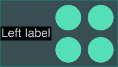
Label above or below the content:
|  |
Label to the left or right of the content:
|  |
Multiple inline labels to the left or right of the content:
| 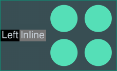 |
Label behind the content:
| 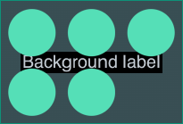 |
Labels on both sides of the content:
| 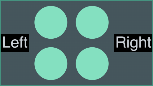 |
See the Styling Combos and Combo Tightness stories for examples of open combo styling.
The
options.combo.autoSelectionStyle property controls default behavior on selecting nodes and links,
when there are combos on the chart. When a node or link that is within a combo, or connected to a combo, is selected,
it and its neighbors, including the contents of summary links, are brought to the foreground. If you wish to create
custom behavior, you can do so by setting autoSelectionStyle to false, and using the contents and
summary properties returned in a handler for
onCombineLinks. Here is an example of switching between
showing all contents, and showing only the summary links using onCombineLinks:
import React, { useState, useEffect } from 'react';
import ReactDOM from 'react-dom';

import { Chart } from 'regraph';

const settings = {
  options: {
    navigation: false,
    overview: false,
    backgroundColor: 'rgb(61, 72, 82)',
    combo: { autoSelectionStyle: false },
  },
  onWheel: ({ preventDefault }) => {
    preventDefault();
  },
};

const panelStyle = {
  backgroundColor: 'hsl(211, 12%, 43%)',
  color: 'hsl(210, 16%, 82%)',
  display: 'flex',
  padding: '8px 12px',
};

const labelStyle = {
  margin: '8px',
};

const wrapperStyle = {
  position: 'relative',
  height: '99%',
  display: 'flex',
  flexDirection: 'column',
};

export default function Combos() {
  const [data] = useState(generateData());
  const [contents, showContents] = useState(true);
  const [combine, setCombine] = useState({
    level: 1,
    properties: ['city'],
  });

  useEffect(() => {
    setCombine((currentCombine) => ({ ...currentCombine }));
  }, [contents]);

  return (
    <div style={wrapperStyle}>
      <div style={panelStyle}>
        <label style={labelStyle}>Show links:</label>
        <label style={labelStyle}>
          <input
            type="radio"
            style={{ width: 'auto' }}
            name="contents"
            defaultChecked
            onChange={() => showContents(true)}
          />
          Contents
        </label>
        <label style={labelStyle}>
          <input
            type="radio"
            style={{ width: 'auto' }}
            name="contents"
            onChange={() => showContents(false)}
          />
          Summary
        </label>
      </div>
      <Chart
        items={data}
        combine={combine}
        onCombineLinks={({ setStyle }) => {
          setStyle(updateSummaryLink(contents));
        }}
        onCombineNodes={styleCombo}
        {...settings}
      />
    </div>
  );
}

function updateSummaryLink(contents) {
  return {
    color: 'rgb(7, 156, 131)',
    width: 4,
    contents,
    summary: !contents,
  };
}

function styleCombo({ setStyle, combo }) {
  setStyle({
    color: 'rgb(46, 56, 66)',
    border: { color: 'rgb(7, 156, 131)' },
    label: {
      text: combo.city.replace(/(^|\s)\w/g, (char) => char.toUpperCase()),
      color: 'rgb(202, 209, 216)',
      backgroundColor: 'rgba(0,0,0,0)',
    },
  });
}

function generateData() {
  const items = {
    pierre: {
      color: '#5fe3bf',
      label: {
        text: 'Pierre',
        color: 'rgb(46, 56, 66)',
        backgroundColor: 'rgba(0,0,0,0)',
      },
      data: { city: 'paris' },
    },
    amelie: {
      color: '#5fe3bf',
      label: {
        text: 'Amelie',
        color: 'rgb(46, 56, 66)',
        backgroundColor: 'rgba(0,0,0,0)',
      },
      data: { city: 'paris' },
    },
    jean: {
      color: '#5fe3bf',
      label: {
        text: 'Jean',
        color: 'rgb(46, 56, 66)',
        backgroundColor: 'rgba(0,0,0,0)',
      },
      data: { city: 'paris' },
    },
    chad: {
      color: '#5fe3bf',
      label: {
        text: 'Chad',
        color: 'rgb(46, 56, 66)',
        backgroundColor: 'rgba(0,0,0,0)',
      },
      data: { city: 'san jose' },
    },
    bret: {
      color: '#5fe3bf',
      label: {
        text: 'Bret',
        color: 'rgb(46, 56, 66)',
        backgroundColor: 'rgba(0,0,0,0)',
      },
      data: { city: 'san jose' },
    },
    hailey: {
      color: '#5fe3bf',
      label: {
        text: 'Hailey',
        color: 'rgb(46, 56, 66)',
        backgroundColor: 'rgba(0,0,0,0)',
      },
      data: { city: 'san jose' },
    },
    amelie_jean: {
      id1: 'amelie',
      id2: 'jean',
      width: 2,
      color: 'rgb(7, 156, 131)',
    },
    bret_amelie: {
      id1: 'bret',
      id2: 'amelie',
      width: 2,
      color: 'rgb(7, 156, 131)',
    },
    chad_pierre: {
      id1: 'chad',
      id2: 'pierre',
      width: 2,
      color: 'rgb(7, 156, 131)',
    },
    chad_bret: {
      id1: 'chad',
      id2: 'bret',
      width: 2,
      color: 'rgb(7, 156, 131)',
    },
    hailey_jean: {
      id1: 'hailey',
      id2: 'jean',
      width: 2,
      color: 'rgb(7, 156, 131)',
    },
  };

  return items;
}

ReactDOM.render(<Combos />, document.getElementById('app'));
When placing nodes inside open combos, ReGraph uses arrangements instead of layouts to make the best use of space. You can also use the tightness option to specify how closely items are spaced together.
You can pass the arrangement name directly to arrange, or pass in an object to also set additional options:
<Chart onCombineNodes={
  (comboDefinition) => {
    const { nodes, combo, id, setStyle } = comboDefinition;
    setStyle({
      arrange: {
        name: 'sequential',
        orientation: 'right',
        linkShape: 'curved',
        tightness: 7
      }
    });
  }
}/>
LensAs with the lens layout, this arrangement pushes highly-connected nodes into the center, and forces less connected nodes into the periphery. The lens arrangement gives a space-efficient view of networks inside combos. | 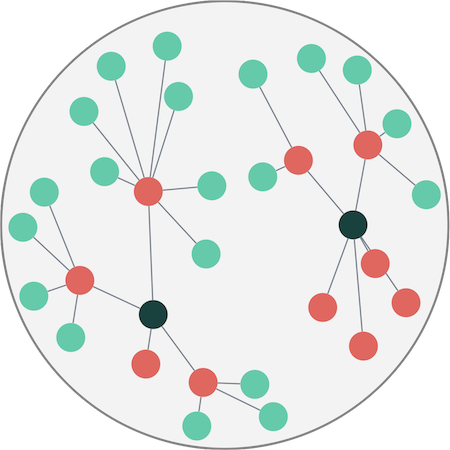 |
GridGrid arrangement lays out nodes in rows and columns. You can control the number of rows or columns with the gridShape option. The grid arrangement provides the best use of space when using rectangular combos. See the Grid Arrange story. | 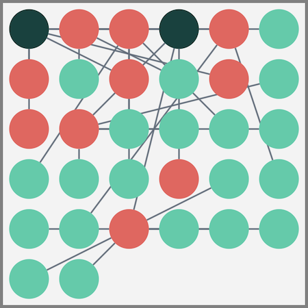 |
ConcentricConcentric arrangement lays out nodes in a series of rings, with larger nodes in the center. The concentric arrangement provides the best use of space within combos when the links within the combo are not important. | 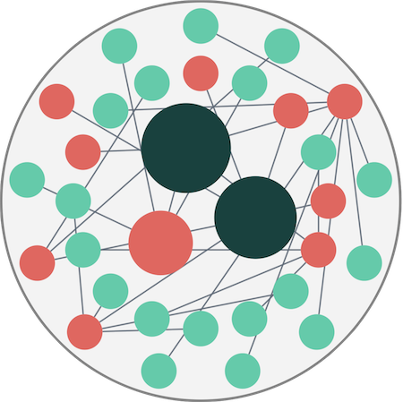 |
SequentialJust like the sequential layout, this arrangement lays out a hierarchy of nodes according to which levels they belong to, and in a way that minimizes empty space and link crossings. You can further customize this arrangement in the arrange object. See the Sequential Arrange story. | 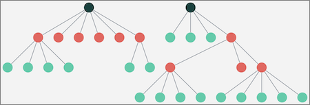 |
When charts contain many links between individual pairs of nodes or combos, it can become difficult to analyze your chart.
Aggregate links let you combine groups of links between two nodes and style them to summarize information about the underlying links, making the chart much easier to understand:
To explore further, see the Link Aggregation story.
Note that centrality measures ignore aggregate links so the results are based on the unaggregated chart.
Enable link aggregation using the aggregateLinks prop. When enabled, any number of links betwen a pair of nodes (including a single link) can be aggregated.
You can set the aggregateLinks prop to true to aggregate all the links between node pairs, or:
// myProperty is a custom property on data
aggregateLinks: { aggregateBy: 'myProperty' };
// myProperty is a custom property on data
aggregateLinks: { aggregateBy: 'myProperty', aggregateByDirection: true };
When an aggregate link is created between a pair of nodes or combos, its
id1 and
id2
properties are assigned in the alphabetical order of the node/combo ids.
This creates consistency in case the id1 and id2 properties
of underlying child links aren't all assigned in the same order.
You should consider this alphabetical order if you:
Reversed order of aggregate and child links
can also affect sequential layout when top or level aren't specified.
The default styling for an aggregate link is the same as for a regular link, i.e. a gray link with a width of 1.
Aggregate links inherit any arrows set on end1 and end2
properties of the child links. They do not inherit any other styling properties.
Styling for aggregate links is done in the
onLinkAggregation
event.
When aggregateLinks is set,
the event is invoked each time an aggregate link is created, deleted or updated.
The update occurs when at least one of its child links is updated in a relevant way:
When invoked, the onLinkAggregation event returns the link's id and other information
in an aggregateLinkDefinition object.
To style aggregate links, call the setStyle function
in the onLinkAggregation event handler:
<Chart onLinkAggregation={
  ({ links, id1, id2, id, aggregateByValue, change, setStyle }) => {
    setStyle({
      // styles the link width proportionately to number of children
      width: Math.sqrt(Object.keys(links).length)
    });
  }
}/>
The Link Aggregation story uses styling to summarize information about the child links.
Annotations help explain narratives in your charts and allow users to provide context and highlight important insights directly in the chart.
Annotations do not scale during zooming and stay readable at any chart size and zoom level. You can style and customize them to fit any application design, and export annotated charts using the export method.
To learn more, head over to the Annotation stories and the Annotations API Reference.
import React from 'react';
import ReactDOM from 'react-dom';

import { Chart } from 'regraph';

export default function Annotations() {
  const items = {
    node1: {
      color: '#9aa5b1',
    },
    annotation1: {
      subject: 'node1',
      connectorStyle: {
        color: 'rgb(255, 82, 82)',
        lineStyle: 'dashed',
        container: 'circle',
        width: 2,
      },
      shape: {
        width: 160,
        height: 56,
      },
      color: 'rgb(254, 167, 154)',
      borderRadius: 3,
      label: [
        {
          fontIcon: {
            fontFamily: 'Font Awesome 5 Free',
            text: 'fas fa-envelope',
          },
          fontSize: 16,
          backgroundColor: 'rgb(255, 82, 82)',
          border: {
            width: 1,
            radius: 3,
          },
          padding: 6,
          position: {
            vertical: 'top',
            horizontal: 'left',
          },
          margin: {
            left: 10,
            right: 10,
            top: 16,
          },
        },
        {
          text: 'Node annotation',
          position: {
            horizontal: 35,
            vertical: 'inherit',
          },
          padding: {
            top: 22,
            left: 10,
          },
        },
      ],
    },
    annotation2: {
      subject: [],
      shape: {
        width: 230,
        height: 56,
      },
      color: 'rgb(197, 247, 233)',
      borderRadius: 3,
      label: [
        {
          fontIcon: {
            fontFamily: 'Font Awesome 5 Free',
            text: 'fas fa-exclamation-triangle',
          },
          fontSize: 16,
          backgroundColor: '#17BA99',
          border: {
            width: 1,
            radius: 3,
          },
          padding: 6,
          position: {
            vertical: 'top',
            horizontal: 'left',
          },
          margin: {
            left: 10,
            right: 10,
            top: 16,
          },
        },
        {
          text: 'Annotation without subjects',
          position: {
            horizontal: 35,
            vertical: 'inherit',
          },
          padding: {
            top: 22,
            left: 10,
          },
        },
      ],
    },
  };

  const settings = {
    options: {
      iconFontFamily: 'Font Awesome 5 Free',
      backgroundColor: 'rgb(61, 72, 82)',
      navigation: false,
      overview: false,
    },
    onWheel: ({ preventDefault }) => {
      preventDefault();
    },
  };

  return (
    <Chart
      items={items}
      annotationPositions={{
        annotation1: { angle: 90, distance: 50 },
        annotation2: { x: 100, y: -100 },
      }}
      {...settings}
    />
  );
}

const FontReadyChart = React.lazy(() =>
  document.fonts.load("24px 'Font Awesome 5 Free'").then(() => ({
    default: Annotations,
  })),
);

export function AnnotationsDemo() {
  return (
    <React.Suspense fallback="">
      <FontReadyChart />
    </React.Suspense>
  );
}

ReactDOM.render(<AnnotationsDemo />, document.getElementById('app'));
In the chart, you can annotate nodes, links and open and closed combos. You can also create free-standing annotations without any subjects.
Annotations can have a single or multiple subjects, and even annotate a combination of nodes, links and combos.
Annotations are passed in the items prop. The subject array is set differently for annotations with and without subjects:
<Chart
  items={{
    node1: { color: '#17BA99' },
    annotation1: {
      subject: 'node1',    //  node1 is the subject
      label: { text: 'Node annotation' },
    },
    annotation2: {
      subject: [],    //  an empty array indicates no subjects
      label: { text: 'Annotation without subjects' },
    },
  }}
  annotationPositions={{
    annotation2: { x: 0, y: -200 },   // required for no-subject annotations
  }}
/>
Annotations without subjects still require the subject array to be set.
You can set it to an empty array.
Note that if your application code contains logic checking
whether a chart item is either a node or a link
( if (!item.id1) { code for nodes } ),
adding annotations into your code may require changes to also consider annotations.
See how to annotate items in the Annotations Basics story.
Annotations are drawn in their own separate layer on top of the chart. There are two ways of positioning annotations:
You can position annotations relative to their subjects
and control their angle and the distance from their subjects in the
annotationPositions prop.
When a layout is run or when their subjects are repositioned, annotations also move to keep their position relative to their subjects. Manually dragging the annotation updates its position.
Subject-relative annotations are drawn when at least one of their subjects is visible in the chart. If subjects are inside a combo, annotations are only drawn when the combo is open.
You can use the getRelativeAnnotationPosition instance method to get subject-relative positions of annotations.
You can position any annotation (with or without subjects) on the chart in world coordinates by setting the
x and y properties in the
annotationPositions prop.
When positioned using coordinates, annotations remain fixed even during changes to the chart such as zooming, panning, items moving or subject changing. Manually dragging the annotation updates its position.
World-coordinate annotations do not depend on subjects for positioning and are drawn even if no subjects are visible in the chart.
You can use the getWorldAnnotationPosition instance method to get world-coordinate positions of annotations.
If you want to position annotations using view coordinates, you can use the viewCoordinates instance method to convert world coordinates into view coordinates.
A default annotation has two main parts:
The connector further splits into three parts:
|  |
The connector is styled in the connectorStyle object. The color, lineStyle and width options style the whole connector. Setting width to 0 hides the connector and creates an annotation that isn't visibly connected to subjects but stays in a relative position to them.
See the Annotations Basics story to learn more about different annotation parts.
The body is styled in the annotation object. The shape and border objects and the color property customize the dimensions, border style and background of the body shape. The glyph and label arrays can be used to add multiple labels and glyphs on the body.
Take a look at the Advanced Annotation Gallery for various examples and levels of styling.
Using labels or glyphs, you can create custom user controls on annotations and respond to chart events triggered by interacting with the controls:
// example onClick handler where the 2nd label is a delete button

const clickHandler = ({ id, itemType, subItem }) => {
  const item = items[id];
  if (
    item &&
    itemType === 'annotation' &&        // if this item is an annotation
    subItem.type === 'label' &&         // and the clicked label
    subItem.index === 1                 // has an index of 1 in the label array
  ) {
    // code for delete button here
  }
};
Find examples of user controls in the Advanced Annotation Gallery story.
You can also create annotations with user-editable text fields or any other custom elements by overlaying your own HTML elements over ReGraph annotations. For more details, head to the User-created Annotations story.
Subject-relative annotations are drawn when at least one of their subjects is visible in the chart.
World-coordinate annotations are drawn even if no subjects are visible in the chart.
This means that annotations without subjects are always visible as as they can only be positioned using world coordinates.
While annotations are loaded into the chart just like nodes and links, they are a special type of always-readable chart item that are not considered as items by the layout algorithms. As a result, some of their behavior is different from other chart items:
The time bar shows activity over time, either as histogram bars or a smooth area plot.
Data in the time bar can be represented as instantaneous events or as periods of time with fixed start and end points. Time periods can be unbounded at one end.
import React from 'react';
import ReactDOM from 'react-dom';

import { TimeBar } from 'regraph';

const settings = {
  options: {
    backgroundColor: 'rgb(81, 95, 108)',
    style: {
      color: 'rgb(45, 205, 168)',
      hoverColor: 'rgb(7, 156, 131)',
    },
    sliders: {
      color: 'rgba(36, 44, 50, 0.5)',
      lineColor: 'rgb(81, 95, 108)',
    },
    labels: {
      fontColor: 'rgb(123, 135, 147)',
    },
    scale: {
      hoverColor: 'rgb(81, 95, 108)',
    },
  },
  onWheel: ({ preventDefault }) => {
    preventDefault();
  },
};

export default function HistogramTimeBar() {
  return <TimeBar items={generateData()} {...settings} />;
}

// Randomly generate 200 data points
function generateData() {
  const items = {};
  for (let i = 0; i < 200; i += 1) {
    items[`dt${i}`] = {
      // Set the date to be today minus a random number of days
      times: [{ time: new Date() - 1000 * 60 * 60 * 24 * (Math.random() * 100) }],
    };
  }
  return items;
}

ReactDOM.render(<HistogramTimeBar />, document.getElementById('app'));
The time bar works well with the chart when it acts as a filter, restricting the chart to only show items within the time bar's visible range. Panning or zooming the time bar will update the visible items in the chart. For an example of this, see the Chart and Time Bar story.
Histogram bars can be split into separate 'stacks' by defining the stack.by options property.
ReGraph will look at the data prop on your time bar items,
and use your specified stack.by property to split each time bar into stacks.
import React from 'react';
import ReactDOM from 'react-dom';

import { TimeBar } from 'regraph';

const styles = {
  backgroundColor: 'rgb(81, 95, 108)',
  style: {
    color: 'rgb(45, 205, 168)',
    hoverColor: 'rgb(7, 156, 131)',
  },
  sliders: {
    color: 'rgba(36, 44, 50, 0.5)',
    lineColor: 'rgb(81, 95, 108)',
  },
  labels: {
    fontColor: 'rgb(123, 135, 147)',
  },
  scale: {
    hoverColor: 'rgb(81, 95, 108)',
  },
};

export default function StackedTimeBar() {
  const items = {
    event1: {
      times: [
        {
          time: {
            start: Date.now() - 25000000,
            end: Date.now() + 25000000,
          },
        },
      ],
      data: {
        country: 'fr',
      },
    },
    event2: {
      times: [
        {
          time: {
            start: Date.now() - 10000000,
            end: Date.now() + 10000000,
          },
        },
      ],
      data: {
        country: 'gb',
      },
    },
  };
  const settings = {
    options: {
      ...styles,
      stack: {
        by: 'country',
        styles: {
          fr: { color: 'rgb(45, 205, 168)', hoverColor: 'rgb(7, 156, 131)' },
          gb: { color: 'rgb(247, 208, 110)', hoverColor: 'rgb(200, 153, 45)' },
        },
      },
    },
    onWheel: ({ preventDefault }) => {
      preventDefault();
    },
  };

  return <TimeBar items={items} {...settings} />;
}

ReactDOM.render(<StackedTimeBar />, document.getElementById('app'));
By setting the mode prop, you can view the time bar as a histogram with bars showing activity
at discrete intervals, or as a smooth distribution with a continuous line. The height at the top of a
bar or the peak of a curve is determined by the sum of values of all items at that point.
import React from 'react';
import ReactDOM from 'react-dom';

import { TimeBar } from 'regraph';

const settings = {
  options: {
    backgroundColor: 'rgb(81, 95, 108)',
    style: {
      color: 'rgb(45, 205, 168)',
      hoverColor: 'rgb(7, 156, 131)',
    },
    sliders: {
      color: 'rgba(36, 44, 50, 0.5)',
      lineColor: 'rgb(81, 95, 108)',
    },
    labels: {
      fontColor: 'rgb(123, 135, 147)',
    },
    scale: {
      hoverColor: 'rgb(81, 95, 108)',
    },
  },
  onWheel: ({ preventDefault }) => {
    preventDefault();
  },
};

export default function HistogramTimeBar() {
  return <TimeBar items={generateData()} mode="smooth" {...settings} />;
}

// Randomly generate 200 data points
function generateData() {
  const items = {};
  for (let i = 0; i < 200; i += 1) {
    items[`dt${i}`] = {
      // Set the date to be today minus a random number of days
      times: [{ time: new Date() - 1000 * 60 * 60 * 24 * (Math.random() * 100) }],
    };
  }
  return items;
}

ReactDOM.render(<HistogramTimeBar />, document.getElementById('app'));
In smooth mode, the height of the line between the peaks is based on interpolated values based on the distribution of data. Hover styles, highlighting and stacks are unavailable.
All time bar modes support up to three selection lines, which can show the trend of a subset of data against the full data set. Note that the scale used for selection lines is different to that of the main bars or curve.
import React from 'react';
import ReactDOM from 'react-dom';

import { TimeBar } from 'regraph';

const settings = {
  options: {
    backgroundColor: 'rgb(81, 95, 108)',
    style: {
      color: 'rgb(45, 205, 168)',
      hoverColor: 'rgb(7, 156, 131)',
    },
    sliders: {
      color: 'rgba(36, 44, 50, 0.5)',
      lineColor: 'rgb(81, 95, 108)',
    },
    labels: {
      fontColor: 'rgb(123, 135, 147)',
    },
    scale: {
      hoverColor: 'rgb(81, 95, 108)',
    },
  },
  onWheel: ({ preventDefault }) => {
    preventDefault();
  },
};

export default function SelectionTimeBar() {
  const { items, selection } = generateData();
  return <TimeBar items={items} selection={selection} mode="smooth" {...settings} />;
}

// Randomly generate 200 data points
function generateData() {
  const items = {};
  const selection = {};
  for (let i = 0; i < 200; i += 1) {
    items[`dt${i}`] = {
      // Set the date to be today minus a random number of days
      times: [{ time: new Date() - 1000 * 60 * 60 * 24 * (Math.random() * 100) }],
    };
    if (Math.random() > 0.7) {
      // Add some items to the selection line
      selection[`dt${i}`] = true;
    }
  }
  return { items, selection };
}

ReactDOM.render(<SelectionTimeBar />, document.getElementById('app'));
Every geographical region has its own standard time zone. Each zone has a UTC offset, which is the difference in hours and minutes from Universal Coordinated Time (UTC).
Many regions observe Daylight Saving Time (DST), where the offset changes during the seasons. Offset rules may also change for upredictable political reasons.
The JavaScript Date constructor treats most input formats as local time. There are two exceptions that use UTC:
See also the MDN Docs on Date() constructor for more details.
ReGraph has no built-in functionality to manage time zones, and displays dates exactly as they're passed in. The ReGraph API accepts dates as either Date objects or millisecond numbers, but always returns dates as Date objects.
You will need to decide which time zone to use for ReGraph events. The most common choices are either the user’s time zone or UTC.
If users want dates in their local time zone and your server stores dates with time zones, pass the dates directly to the client:
// serverside

// YYYY-MM-DDTHH:mm:ss.sssZ, T = time, Z = UTC time with zero offset
const storedDate = '2019-05-22T15:58:33.592Z';
// send storedDate directly to client
Then create a JavaScript Date object to convert to the user's local time:
// clientside
const dateToUse = Date.parse(storedDate);
<TimeBar
  items={{
    node1: {
      times: [{ time: dateToUse }],
    },
  }}
/>
ReGraph then displays the date in the user’s time zone.
If your dates don’t have time zones, JavaScript creates a Date object assuming the date is in local time already:
// clientside
// date string without a time zone
const zonelessDateString = 'Mon, 11 May 2015 15:00:00';
// date will be shown in the user’s time zone.
const dateInLocalTime = new Date(zonelessDateString);
ReGraph will then display the date as 3pm in the user’s time zone.
The range returned by time bar's
onChange
event is in local time.
When filtering time, we recommend converting local Date objects to UTC milliseconds to avoid unwanted time zone conversions:
const ms = Date.UTC(
  localDate.getFullYear(),
  localDate.getMonth(),
  localDate.getDate(),
  localDate.getHours(),
  localDate.getMinutes(),
  localDate.getSeconds(),
  localDate.getMilliseconds(),
);
ReGraph comes with several powerful graph analysis functions which you can use to quickly add insight to your data. Using analysis functions, you can:
To use the graph functions, you must import them first. As an example, let's import the neighbors function:
import { neighbors } from 'regraph/analysis';
We can then call the function:
const neighboringItems = await neighbors(data, { nodeId: {} });
// neighboringItems = { nodeA: {}, nodeB: {}, 'linkA-B': {} }
This resolves to an object with the neighboring items. We can pass this result directly into our selected state and redraw:
this.setState({ selection: neighboringItems });

// in our render() function
const { items, selection } = this.state;
<Chart items={items} selection={selection} />
By default, graph functions run on nodes and links in the underlying chart level, which means that they ignore combos, summary links and aggregate links, which are present at the top level. The Combo Path Finding story shows how to include items at the top chart level.
For more details and inspiration, see the API Reference and Graph Analysis stories.
Social network analysis (SNA) or centrality measures are a vital tool for understanding the behavior of networks and graphs. These algorithms use graph theory to calculate the importance of any given node in a network.
Each centrality measure has strengths and weaknesses in identifying features of a network, so it is important to choose the right one.
The examples below show different centrality measures against a directed graph (i.e. the centrality calculations take the directions of links into account).
Degree is the simplest form of centrality, and assigns scores to nodes based purely on the number of links held by each node. It tells us how many direct, ‘one hop’ connections each node has to other nodes within the network.
It is used for finding very connected individuals, popular individuals, individuals who are likely to hold most information or individuals who can quickly connect with the wider network.
Betweenness centrality measures the number of times a node lies on the shortest path between other nodes.
This measure shows which nodes act as ‘bridges’ between nodes in a network. In other words, which nodes would have the greatest impact on the connectivity of the network if they were removed.
It is used for finding the nodes who influence the flow around a system. Betweenness is useful for analyzing communication dynamics in a network. A high betweenness count could indicate authority over, or controlling collaboration between, otherwise unconnected groups in a network; or indicate being on the edge of multiple groups.
Closeness calculates the shortest paths between all nodes and then assigns each node a score based on the total length of shortest paths from that node. This measure scores each node based on its ‘closeness’ to all other nodes within the network.
In a fully connected graph, where there is a path from any node to any other node, closeness is calculated as the reciprocal of 'farness'; the farness of a node is the sum of the distances to each other node.
Closeness can help find good ‘broadcasters’, i.e., individuals in positions of influence. However, in a highly connected network, you will often find all nodes have a similar score. In this case closeness may be more useful at finding influencers within a single cluster.
For fully connected graphs ReGraph adds up the values of the paths to all other nodes in the network (the 'farness') and then takes the reciprocal as the closeness.
For disconnected components, as some paths have infinite length, the algorithm instead takes the reciprocal of each path individually and then sums the values. This stops infinite values from producing an infinite closeness.
Like degree centrality, eigencentrality measures a node's influence based on the number of links it has to other nodes within the network. Eigencentrality then goes a step further by also looking at how many links their connections have, and so on through the network.
By calculating the extended connections of a node, eigencentrality can identify nodes with influence over the whole network, not just those directly connected to it.
Eigencentrality is a good ‘all-round’ SNA score, and is useful for understanding human social networks, but also for understanding networks like malware propagation.
PageRank is a variant of eigencentrality, assigning nodes a score based on their connections, and their connections’ connections. The difference is that PageRank also takes link direction into account – so links can only pass influence in one direction, and pass different amounts of influence.
PageRank is famously one of the ranking algorithms behind the original Google search engine (the 'Page' part comes from creator and Google founder, Larry Page).
This measure uncovers nodes whose influence extends beyond their direct connections into the wider network.
Because it factors in directionality and connection weight, PageRank can be helpful for understanding citations and authority.
ReGraph lets you use custom fonts for text inside glyphs and labels. Font icons can be used as node icons, glyph icons (on nodes, links, annotations and combos) and label icons (inside node and annotation labels).
You can use any web font library or create custom font families for your application design.
ReGraph lets you use fonts from a variety of sources including:
.woff or .ttf files)For any source, we recommend using document.fonts from the CSS Font Loading API to ensure fonts are fully loaded before rendering. This approach is used in the guides below.
Fonts define the look of characters including letters, numbers and symbols. Many font families offer multiple font variants with different font weights or styles. ReGraph fully supports custom fonts and renders them consistently across the chart.
ReGraph uses 'sans-serif' as the default font family.
See the Advanced Node Gallery with Raleway, Montserrat and Valera Round fonts.
If you don't have a ReGraph project, follow the steps in Create New ReGraph App to create a quick app with a single "Hello World" node.
In your project's root folder, add the font to your HTML file. We're using the Google Raleway font and a CDN link from Google Fonts to generate a script for two different font weights, 400 and 800:
For the "Hello World" app, add the script in my-regraph-app/index.html:
<!-- index.html -->

<!-- weights 400 and 800 -->
<link rel="stylesheet" type="text/css"
href="https://fonts.googleapis.com/css2?family=Raleway:wght@400;800&display=swap" />
To use multiple font weights or styles of the same font,
you must update your application's CSS with a unique @font-face declaration for each variant.
If you are only using a single font weight or style, no CSS changes are needed.
If you are using a CDN link,
click the link generated in the script to find the @font-face rules.
For the "Hello World" app, you can add the CSS code in my-regraph-app/src/App.css:
/* src/App.css */

@font-face {
  font-family: 'Raleway';
  font-style: normal;
  font-weight: 400;
  font-display: swap;
  src: url('https://fonts.gstatic.com/s/raleway/v28/1Ptug8zYS_SKggPNyCMIT5lu.woff2') format('woff2');
}

@font-face {
  font-family: 'Raleway Bold';  /* create a unique name for this font weight */
  font-style: normal;
  font-weight: 800;
  font-display: swap;
  src: url('https://fonts.gstatic.com/s/raleway/v28/1Ptug8zYS_SKggPNyCMIT4ttDfA.woff2') format('woff2');
}
Import the React library in the file where your ReGraph component is declared. For the "Hello World" app, this is in my-regraph-app/src/App.jsx:
// src/App.jsx

import React from 'react';  // will be needed later
Next, set the default fontFamily
in chart options. This font is used inside labels and glyphs
unless a font family is explicitly set on the label/glyph in the fontFamily property.
// src/App.jsx

<Chart
  // ...
  options={{ labels: { fontFamily: "Raleway" } }}
/>
Next, define and load the fonts and start the app once the fonts have loaded.
Add the following code after the App() function:
// src/App.jsx

// lazy-loads the chart after the font is available
const FontReadyChart = React.lazy(() =>
  Promise.all([
    document.fonts.load("24px 'Raleway'"),
    document.fonts.load("24px 'Raleway Bold'"),   // defined in CSS in step 2
  ]).then(() => ({
    default: App,
  }))
);

// main component (Demo) renders ReGraph chart
// rendering suspended until fonts are ready
function Demo() {
  return (
    <React.Suspense fallback="Loading fonts...">
      <FontReadyChart />
    </React.Suspense>
  );
}

export default Demo; // replaces export default App; previously in your code
The fonts are now loaded and we can use them in our chart.
Update the items prop:
// src/App.jsx

<Chart
  items={{
    node1: { label: { text: "Hello World!" } },
    node2: { label: { text: "Hello Bold!", fontFamily: "Raleway Bold" }},
  }}
  options={{ labels: { fontFamily: "Raleway" } }}
/>
At the end of this step, you should see a custom font with two different weights in your app.
Font icons are vector-based glyphs embedded in font files, where specific character codes are mapped to icons instead of traditional letters or numbers. They are highly customizable as you can scale their size and dynamically change their color.
See the Font Awesome, Material Icons and IcoMoon stories for examples with different font icon libraries.
In your project's root folder, open a new terminal and install the latest version of your icons using your preferred package manager. We're using Font Awesome Free Icons.
npm install --save @fortawesome/fontawesome-freeyarn add @fortawesome/fontawesome-freepnpm install --save @fortawesome/fontawesome-freeIn the file where your ReGraph component is declared, import the font icon families and the React library. For the "Hello World" app, this is in my-regraph-app/src/App.jsx:
// src/App.jsx

import "@fortawesome/fontawesome-free/css/all.css"; // both solid and regular style
import React from 'react';               // will be needed later
Next, set the default iconFontFamily
in chart options. This is used unless a font family is explicitly set on the item/subitem
in the fontFamily property.
// src/App.jsx

<Chart
  // ...
  options={{ iconFontFamily: "Font Awesome 6 Free" }}
/>
Next, define and load the fonts and start the app once the fonts have loaded.
Add the following code after the App() function:
// src/App.jsx

// lazy-loads the chart after the font is available
const FontReadyChart = React.lazy(() =>
  Promise.all([                        // include both as we imported all.css in step 2
    document.fonts.load('900 16px "Font Awesome 6 Free"'),  // fas (solid, weight 900)
    document.fonts.load('400 16px "Font Awesome 6 Free"'),  // far (regular, weight 400)
  ]).then(() => ({
    default: App,
  }))
);

// main component (Demo) renders ReGraph chart
// rendering suspended until fonts are ready
function Demo() {
  return (
    <React.Suspense fallback="Loading fonts...">
      <FontReadyChart />
    </React.Suspense>
  );
}

export default Demo; // replaces export default App; previously in your code
The font icons are now loaded and we can use them in our chart.
Update the items prop in the App() function:
// src/App.jsx

  items={{
    node1: { label: { text: "Hello World!" } },
    node2: {
      label: [
        { fontIcon: { text: 'far fa-handshake' } },
        {
          fontIcon: { text: 'fas fa-globe', color: '#2B65EC' },
          position: { vertical: 'inherit' },
        },
    ]},
  }}
At the end of this step, you should see two nodes in your application - one with a text label and another one with font icons.
Some font icons offer multiple font weights or styles as variants of the same font family.
For example, Font Awesome Free Icons are either Regular (far) or Solid (fas),
which should be specified as part of the icon's CSS class name
in the text property of fontIcon.
Others, such as Material Icons or Material Symbols, can include variants such as Filled, Outlined, Rounded or Sharp,
where each variant must be imported separately and specified in the fontFamily property.
The text property only requires the icon's ligature string.
To use a mix of weights or styles,
declare a font family for each using @font-face in your CSS
and give each a unique font-family name, for example:
/* Font weight of 300 */
@font-face {
  font-family: 'Material Symbols Sharp Thin'; /* a unique name in your CSS */
  font-style: normal;
  font-weight: 300;
  src: url(https://fonts.gstatic.com/s/materialsymbolssharp/v249/gNNBW2J8Roq16WD5tFNRaeLQk6-SHQ_R00k4c2_whPnoY9ruReaU4bHmz74m0ZkGH-VBYe1x0TV6x4yFH8F-H5OdzEL3sVTgJtfbYxPVojCLJ1H7-0Hk.woff2) format('woff2');
}

/* Font weight of 700 */
@font-face {
  font-family: 'Material Symbols Sharp Thick'; /* a unique name in your CSS */
  font-style: normal;
  font-weight: 700;
  src: url(https://fonts.gstatic.com/s/materialsymbolssharp/v249/gNNBW2J8Roq16WD5tFNRaeLQk6-SHQ_R00k4c2_whPnoY9ruReaU4bHmz74m0ZkGH-VBYe1x0TV6x4yFH8F-H5OdzEL3sVTgJtfbYxNspTCLJ1H7-0Hk.woff2) format('woff2');
}
See the Adding Fonts tutorial in the Fonts section
for an example using @font-face rules.
The Material Icons story imports the variants as separate CDN links in the HTML tab.
You can set a color
as well as a custom
fontFamily
for the particular item's font icon inside the item's fontIcon property.
In addition, depending on the item where the font icon is used, ReGraph lets you customize its various properties:
position or fontSize.
The example below uses Font Awesome Free Icons in Solid:
import React from 'react';
import ReactDOM from 'react-dom';
import { Chart } from 'regraph';
import '@fortawesome/fontawesome-free/css/fontawesome.css';
import '@fortawesome/fontawesome-free/css/solid.css';

export default function FontIcons() {
  const items = {
    node1: {
      color: 'rgba(0,0,0,0)',
      border: { color: 'rgb(95, 227, 191)' },
      label: { color: 'rgba(0,0,0,0)' },
      fontIcon: {
        text: 'fas fa-user',
        color: 'rgb(95, 227, 191)',
      },
    },
    node2: {
      color: 'rgba(0,0,0,0)',
      border: { color: 'rgb(247, 208, 110)' },
      label: { color: 'rgba(0,0,0,0)' },
      fontIcon: {
        text: 'fas fa-desktop',
        color: 'rgb(247, 208, 110)',
      },
    },
    node3: {
      color: 'rgba(0,0,0,0)',
      border: { color: 'rgb(241, 93, 91)' },
      label: { color: 'rgba(0,0,0,0)' },
      fontIcon: {
        text: 'fas fa-shield-virus',
        color: 'rgb(241, 93, 91)',
      },
    },
  };

  const positions = {
    node1: { x: 0, y: 0 },
    node2: { x: -90, y: 0 },
    node3: { x: 90, y: 0 },
  };

  const options = {
    iconFontFamily: 'Font Awesome 5 Free',
    imageAlignment: {
      'fas fa-user': { size: 0.9 },
      'fas fa-desktop': { size: 0.8 },
    },
    navigation: false,
    overview: false,
    backgroundColor: 'rgb(61, 72, 82)',
  };

  const events = {
    onWheel: ({ preventDefault }) => {
      preventDefault();
    },
  };

  return <Chart items={items} positions={positions} options={options} {...events} />;
}

const FontReadyChart = React.lazy(() =>
  document.fonts.load("24px 'Font Awesome 5 Free'").then(() => ({
    default: FontIcons,
  })),
);

export function Demo() {
  return (
    <React.Suspense fallback="Loading icons...">
      <FontReadyChart />
    </React.Suspense>
  );
}

ReactDOM.render(<Demo />, document.getElementById('app'));
If you complete the Adding font icons guide and the font icons are not displayed, you might be using an older version of ReGraph. In ReGraph 5.3 or older, Web Font Loader was used as an internal dependency to load font icons. Upgrade ReGraph to the latest version and review and repeat the tutorial steps to fix this issue. If you need help upgrading, see the Updating documentation or contact [email protected]. |  |
If you complete the Adding font icons guide
and the font icons are showing only as the plain text specified in the |  |
If you are importing font files using @import inside a CSS file, the validations in FontReadyChart
can sometimes be executed before the CSS is processed. As a result, icons can fail to load and instead show as the plain text specified in the text option.
To fix this, include document.fonts.ready at the top of the chain of promises:
// lazy-loads the chart after the font is available
const FontReadyChart = React.lazy(() =>
  document.fonts.ready // resolves once the document has completed loading fonts
    .then(() =>
      Promise.all([ // resolves when ALL the fonts are loaded
        document.fonts.load('1em "Material Icons"'),
        document.fonts.load('1em "Material Icons Outlined"'),
      ])
    )
    .then((p) => ({
      default: App, // loads the component that includes ReGraph
    }))
);
Check the Material Icons demo for an example.
If your Google font icons are not showing, you may be using an older version of ReGraph or referencing them incorrectly. In ReGraph 5.3 or older, it was necessary to use the Unicode character of the icon, or to map the character to a class name using CSS, e.g.
.material-icons.person::before {
  content: '\e7fd';
}
And then to specify the icon:
fontIcon: {
  text: '\ue7fd',   // or 'material-icons person'
},
In ReGraph version 5.4 and newer, you can pass the ligature string of a Google fonts icon
directly in the text property, such as text: 'person'.
We strongly recommend upgrading ReGraph to the latest version. If you want to continue using an older version, check that you are using the Unicode character as described.
ReGraph lets you customize nodes, labels and glyphs with images using the image property,
which accepts a string URL to any standard image type.
<Chart items={{
    node1: {
      image: '/images/person.png'
    }
    node2: {
      image: 'data:image/png;base64,<...>'
    }
  }}
/>
For best results, we recommend using images with a square aspect ratio for nodes (node image) and glyphs (glyph image). Images for labels can have any aspect ratio (label image).
ReGraph supports SVG images in all modern browsers. To further improve cross-browser compatibility, set width and height attributes in your SVG files.
To ensure performance and stability, SVGs are converted to bitmaps when they're drawn, and are restricted to a maximum of 256 x 256 pixels.
ReGraph can performantly display up to 900 distinct 256 x 256 images and font icons, limited only by the user's hardware. Using more than this is not recommended as it may affect chart rendering performance.
The Cross-Origin Resource Sharing
(CORS) protocol imposes security restrictions that can affect images loaded from a different domain to your app.
For example, you might run ReGraph from https://www.myapp.com/graph but fail to load
images from https://s3.amazonaws.com.
ReGraph automatically tries to reload the failing images with the crossorigin HTML attribute set. You can import and use the setCorsAdapter config method to change the value of the attribute.
Any remaining missing or blocked images will appear as a blue X.
To safely display your cross-origin images, consider:
If you control the image server, use Access-Control-Allow-Origin HTTP headers to enable CORS requests.
Store the cross-origin images in URL-encoded strings.
Provide an image proxy service on your app server. Instead of fetching images
directly from their original source (that is, when your data includes an image prop with a value
http://s3.amazonaws.com/<image-name>),
create an endpoint on your app server which
forwards a request from the client.
For example, if you create a proxy endpoint /imageproxy, the image url in your
data would change to /imageproxy?target=http://s3.amazonaws.com/<image-name>.
Your endpoint would extract the image URL from the target query parameter,
fetch the image data, and send it back to the client.
If you are serving images from an S3 bucket through a CDN, and ReGraph is still unable to download images:
Ensure that your CDN cache is configured appropriately (according to your CDN docs).
Ensure that you have also set the Vary HTML response header, and that it includes the values Origin, Access-Control-Request-Headers and Access-Control-Request-Method.
This ensures that the browser always tries to reload the images with the correct headers.
ReGraph is a low-risk, highly secure JavaScript library that is unlikely to be affected by common security vulnerabilities.
ReGraph is a closed source project, with all code controlled by Cambridge Intelligence staff, reviewed by multiple expert developers and tested thoroughly by our experienced QA team.
ReGraph source code is developed and built with an automated toolchain which is configured according to modern best practices to help identify security issues and ensure consistency and quality across the codebase. The toolchain contains a linter (ESlint), a compiler (Babel) and a suite of security scanners, including:
If we identify a vulnerability, we review it internally and deal with it before release.
Our JavaScript files are built using secure processes and hosted on secure web servers. We will never add malicious behaviors to our source code, and we are confident that third parties cannot hijack or compromise our downloads. There is no accepted standard scanner for malicious JavaScript code.
ReGraph requires React (^16.6.0) as peer dependency.
You can install it for example:
npm install react@^16.6.0yarn add react@^16.6.0pnpm install react@^16.6.0ReGraph also requires Lodash (lodash@^4.0.0),
Web Font Loader (webfontloader@^1.6.28)
and Babel's modular runtime helpers (@babel/runtime-corejs3@^7.20);
these are internal dependencies and will be automatically installed
when you install ReGraph. If your project already depends on any of these packages, then your
package manager will only download these modules once.
To integrate ReGraph with Leaflet, ReGraph requires Leaflet (1.9.x).
You can install it for example:
ReGraph uses OpenStreetMap as a default map tile provider.
To use PDF export, ReGraph requires PDFKit and SVG-to-PDFKit. You can install them for example:
npm install pdfkit svg-to-pdfkityarn add pdfkit svg-to-pdfkitpnpm install pdfkit svg-to-pdfkitOnce the dependencies are installed, import the export.js file into your project:
import 'regraph/export';
We strongly recommend that you only use the following versions which have been successfully tested to work with ReGraph:
0.14.00.1.8If you manually installed the above polyfills but you still see this error in the console,
this might be because your build tool doesn't polyfill the process global variable.
To fix this, add your own code to polyfill the process variable
before calling the function that fetches and downloads the image:
window.process = {
  nextTick(callback, ...args) {
    window.requestAnimationFrame(() => callback(...args));
  },
};
ReGraph uses WebGL to render charts. This enables it to use hardware acceleration when supported by the browser. If WebGL is disabled or unsupported, ReGraph uses HTML5 Canvas to render components.
Vector images, such as SVGs, are rasterized when loaded into the chart to improve performance. See Images for more details.
Sometimes, very large charts can seem slow to load or respond to user actions. This is very rarely a rendering issue, and is more likely to be caused by computationally expensive chart actions, like layouts. See our Performance showcase to compare rendering against other operations.
ReGraph includes full type definitions for TypeScript. The minimum supported version is TypeScript 4.7. Older versions may function as well but they haven't been tested and are not officially supported.
See index.d.ts for chart, time bar and object format definitions, and analysis.d.ts for analysis functions.
Types should be automatically available when you import ReGraph.
For complete code examples using TypeScript, see the TypeScript stories.
Cambridge Intelligence has implemented an information security management system that is certified to ISO 27001:2022 for the operations of software development, sale and associated support, all information assets processed and managed and all systems and services where information is processed by Cambridge Intelligence.
This includes:
For further information, please contact our security team.
When building ReGraph into your applications, you may be interested in automated integration testing. ReGraph has a number of helpful APIs available to give you information about the items in the chart.
The onUpdateComplete event is invoked each time the chart has finished updating. Use this event e.g. to check when the chart animation is complete. This event is also suitable for production.
The following functions, currently all in beta, are particularly useful for use in integration tests.
To use them, give access to the chart by exposing your chart's ref on the window:
const MyFunctionalComponent = (props) => {
  const { items } = props;

  const chartRef = React.useRef(null);

  // expose the ref on the top-most window
  window.top.chart = chartRef

  return (
    <Chart
      ref={chartRef}
      items={items}
    />
  );
};
Then you can use them in your tests:
const item = window.chart.current.getItemInfo('node1');
See also Instance Methods for more information.
The getItemAtViewCoordinates instance method returns an object with information about the item or sub-item at the specified view coordinates.
The getItemInfo instance method returns a list of all chart items, or details of a specified item if a valid id is passed.
The getViewCoordinatesOfItem instance method returns an object with view coordinates of the specified item or sub-item.
We offer guidance on common problems installing and running ReGraph. If this doesn't solve your issue, contact support.
Make sure you're using an up-to-date package manager.
We've seen issues when installing with older versions of yarn - we recommend using version 1.13 or greater.
The ReGraph chart will try to size itself to fill its containing element.
You can use CSS properties to set the container's size, just like with any DOM element. Common sizing strategies include using:
height,display: flex on the parent element),position: absolute).If you're having trouble with synchronizing state updates, try running in production mode.
ReGraph can only run in a web browser because it requires the DOM and other Web APIs to render correctly.
If you are using ReGraph with next.js, you need to make sure that ReGraph components are not rendered on the server side.
See the next.js documentation on how to disable SSR.
If some browsers fail to load your SVG icons while others work correctly,
it's likely a browser issue. One of the causes might be the size of the SVG file. To improve cross-browser compatibility, set the width and height attributes in your SVG files
or optimize the size of your SVG using an optimizer such as
SVGO.
Designing accessible products means they can be used effectively by as many people as possible, providing an inclusive experience for people with impairments and different needs.
Accessible design improves the product for everyone, as well as creating a better user experience for users with disabilities. In addition, most countries support accessibility with laws and regulations on both public and private sector organizations.
There is no single universal standard, so we recommend that you always check what policies are relevant for you. However, the W3C's Web Content Accessibility Guidelines 2.1 are most often referenced as an acceptable standard.
ReGraph is not a complete application by itself, it is a toolkit that you integrate into your own product. This means that accessibility should be considered at the level of the end product to give your application users the best user experience possible.
ReGraph as a visual medium is often exempt from compliance requirements because the functionality cannot always be fully reproduced in an accessible way. To help you with your accessibility audits, we have prepared a table that summarizes the guidelines of WCAG 2.1 and how they relate to ReGraph:
We are always working on implementing features that make ReGraph more accessible and easier to use. Some tips using various ReGraph features are listed below.
ReGraph doesn't have any native keyboard navigation behavior,
which means that you can customize keyboard controls
without having to override any default actions.
To help you do this, ReGraph offers a number of native
chart events and
time bar events
that you can respond to. It also supports standard element events
such as keydown, focus and others.
This example shows how to customize keyboard navigation behavior
by calling the pan() and zoom() instance methods
in a handler triggered by a keydown event listener:
import React from 'react';
import ReactDOM from 'react-dom';

import { Chart } from 'regraph';

export default function KeyboardShortcuts() {
  const chartRef = React.useRef(null);
  React.useEffect(() => {
    document.addEventListener('keydown', handleKeyDown);
    return () => {
      // unsubscribe event
      document.removeEventListener('keydown', handleKeyDown);
    };
  }, []);

  const items = {
    a: {
      color: '#17BA99',
      size: 1.5,
      fontIcon: {
        text: 'fas fa-lightbulb',
        color: '#fff9c4',
      },
      label: [
        {
          text: 'Press ← or → keys to pan the chart',
          position: 's',
          backgroundColor: '#fff9c4',
          color: '#1C304A',
        },
        {
          text: 'Press I or O keys to zoom in or out',
          backgroundColor: '#fff9c4',
          color: '#1C304A',
          margin: [10, 0, 0, 0],
        },
      ],
    },
  };

  function handleKeyDown(e) {
    switch (e.key) {
      case 'ArrowRight':
        chartRef.current.pan('right');
        break;
      case 'ArrowLeft':
        chartRef.current.pan('left');
        break;
      case 'i':
        chartRef.current.zoom('in');
        break;
      case 'o':
        chartRef.current.zoom('out');
        break;
      default:
        break;
    }
  }

  return <Chart ref={chartRef} items={items} {...settings} />;
}

const settings = {
  options: {
    iconFontFamily: 'Font Awesome 5 Free',
    overview: false,
    navigation: false,
    backgroundColor: 'rgb(61, 72, 82)',
  },
  onWheel: ({ preventDefault }) => {
    preventDefault();
  },
};

const FontReadyChart = React.lazy(() =>
  document.fonts.load("24px 'Font Awesome 5 Free'").then(() => ({
    default: KeyboardShortcuts,
  })),
);

export function KeyboardShortcutsDemo() {
  return (
    <React.Suspense fallback="">
      <FontReadyChart />
    </React.Suspense>
  );
}

ReactDOM.render(<KeyboardShortcutsDemo />, document.getElementById('app'));
If you want more control over the exact way the chart view changes on a key press,
you can update the view prop to change the view of the chart instead.
Some browsers support some keyboard navigation by default, e.g. using the Tab key to iterate through form controls. When planning keyboard shortcuts, you should avoid overriding native browser and operating system shortcuts that affect the browser behavior.
import React from 'react';
import ReactDOM from 'react-dom';
import { Chart } from 'regraph';

export default function AccessibleStyling() {
  const items = {
    '0_n0': {
      color: 'transparent',
      label: {
        text: 'Use',
        color: 'white',
        fontSize: 25,
        backgroundColor: 'transparent',
      },
    },
    '0_n00': {
      color: 'transparent',
      label: {
        text: `Avoid`,
        color: 'white',
        fontSize: 25,
        backgroundColor: 'transparent',
      },
    },
    '1_n0': {
      color: 'transparent',
      label: {
        text: 'Contrast ratio',
        color: 'white',
        fontSize: 25,
        backgroundColor: 'transparent',
      },
    },
    '1_n1': {
      color: '#17BA99',
      fontIcon: {
        fontFamily: 'Font Awesome 5 Free',
        text: 'fas fa-lightbulb',
        color: '#5fe3bf',
      },
    },
    '1_n2': {
      color: '#17BA99',
      fontIcon: {
        fontFamily: 'Font Awesome 5 Free',
        text: 'fas fa-lightbulb',
        color: '#1C304A',
      },
    },
    '2_n0': {
      color: 'transparent',
      label: {
        text: 'Font',
        color: 'white',
        fontSize: 25,
        backgroundColor: 'transparent',
      },
    },
    '2_n1': {
      color: '#17BA99',
      label: {
        fontSize: 25,
        color: '#1C304A',
        backgroundColor: '#fff9c4',
        text: 'sample text',
        fontFamily: 'serif',
      },
    },
    '2_n2': {
      color: '#17BA99',
      label: {
        fontSize: 25,
        color: '#1C304A',
        backgroundColor: '#fff9c4',
        text: 'sample text',
        fontFamily: 'arial',
      },
    },
    '3_n0': {
      color: 'transparent',
      label: {
        text: 'Non-reliance on colors',
        color: 'white',
        fontSize: 25,
        backgroundColor: 'transparent',
      },
    },
    '3_n1': {
      color: '#17BA99',
      glyphs: [
        {
          position: 'ne',
          color: '#F15d5b',
          size: 1.5,
        },
      ],
    },
    '3_n2': {
      color: '#17BA99',
      glyphs: [
        {
          position: 'ne',
          color: '#F15d5b',
          size: 1.8,
          label: {
            text: 'offline',
            color: '#000000',
          },
        },
      ],
    },
  };

  const dataPositions = {
    '0_n0': {
      x: -150,
      y: -325,
    },
    '0_n00': {
      x: -300,
      y: -325,
    },
    '1_n0': {
      x: -500,
      y: -225,
    },
    '1_n1': {
      x: -300,
      y: -225,
    },
    '1_n2': {
      x: -150,
      y: -225,
    },
    '2_n0': {
      x: -500,
      y: -125,
    },
    '2_n1': {
      x: -300,
      y: -125,
    },
    '2_n2': {
      x: -150,
      y: -125,
    },
    '3_n0': {
      x: -500,
      y: -25,
    },
    '3_n1': {
      x: -300,
      y: -25,
    },
    '3_n2': {
      x: -150,
      y: -25,
    },
  };

  const settings = {
    options: {
      iconFontFamily: 'Font Awesome 5 Free',
      backgroundColor: 'rgb(61, 72, 82)',
      navigation: false,
      overview: false,
    },
    onWheel: ({ preventDefault }) => {
      preventDefault();
    },
  };

  return <Chart items={items} positions={dataPositions} {...settings} />;
}

const FontReadyChart = React.lazy(() =>
  document.fonts.load("24px 'Font Awesome 5 Free'").then(() => ({
    default: AccessibleStyling,
  })),
);

export function AccessibleStylingDemo() {
  return (
    <React.Suspense fallback="">
      <FontReadyChart />
    </React.Suspense>
  );
}

ReactDOM.render(<AccessibleStylingDemo />, document.getElementById('app'));
We recommend using simple sans-serif fonts as they are generally easier to read for most users. Alongside text, you should also convey the meaning in another way that doesn't require reading or understanding the language, such as font icons, glyphs or images.
The colors you use should always have a sufficient contrast ratio. Online tools such as this WebAIM Contrast checker can help you check your color combinations for accessibility. When styling nodes, you can also consider using SVG images with patterns and textures instead of colors.
You should not rely on a single method, such as color, to convey a meaning. On nodes you can also use advanced styling to add labels, images, font icons or glyphs, while on links you can use text-based labels, glyphs, dashed and dotted line styles or flow animation.
To make charts as readable as possible, choose the
layout that best represents the type of your data and connections.
Consider what is the best tightness for your chart.
To reduce the cognitive load, consider foregrounding and backgrounding
relevant or selected items. See more in the
Neighbors story.
ARIA (Accessible Rich Internet Applications), is a set of roles and attributes that can supplement HTML elements or attributes that don't have built-in accessible semantics or behavior.
ReGraph lets you set ARIA properties on the DOM element. The Playground lists all supported ARIA props in the code-autocomplete when you start typing.
Note that there is no programmatic access to nodes/links rendered on the canvas.
You can use aria-hidden property to hide it from screen readers.
<div
  style={{ height: '100%' }}
  aria-label={ `A simple chart` }
  aria-description=
  { `A simple chart with ${Object.keys(items).length} green node(s)` }
>
<Chart aria-hidden={true} items={{ node1: { color: '#2dcda8' } }} />
</div>
Seeing a chart is essential for spotting and understanding the
patterns and connections revealed in the data,
which makes it challenging to make charts accessible e.g. for screen readers.
As an alternative, you can hide the chart's div from screen readers
using the aria-hidden property, and instead supply a text in the aria-description
that summarizes the chart to the extent needed in your context, for example:
The element here is a chart made of nodes and links, where nodes represent employees from several departments and links represent their email communications. The chart communicates that most emails are sent between management and marketing.
You can also use audio as an additional channel to written information or as an extra method of alerting or highlighting, but remember to never rely on audio alone.
import React from 'react';
import ReactDOM from 'react-dom';

import has from 'lodash/has';
import { Chart } from 'regraph';

function isNode(item) {
  return !has(item, 'id1');
}

if (!('speechSynthesis' in window)) {
  throw new Error('Text-to-speech not supported in this browser');
}

export default function TextToSpeech() {
  const items = {
    one: {
      color: '#17BA99',
      size: 1.5,
      label: [
        {
          text: '1',
          fontSize: 40,
          backgroundColor: 'transparent',
          color: '#fff9c4',
        },
      ],
    },
    two: {
      color: '#17BA99',
      size: 1.5,
      label: [
        {
          text: '2',
          fontSize: 40,
          backgroundColor: 'transparent',
          color: '#fff9c4',
        },
      ],
    },
    three: {
      color: '#17BA99',
      size: 1.5,
      label: [
        {
          text: '3',
          fontSize: 40,
          backgroundColor: 'transparent',
          color: '#fff9c4',
        },
      ],
    },
    'one-two': {
      id1: 'one',
      id2: 'two',
      width: 12,
      color: 'rgb(7, 156, 131)',
    },
    'two-three': {
      id1: 'two',
      id2: 'three',
      width: 12,
      color: 'rgb(7, 156, 131)',
    },
    instructions: {
      color: 'transparent',
      label: {
        text: 'Turn on the sound and click nodes and links',
        color: 'white',
        fontSize: 30,
        backgroundColor: 'transparent',
      },
    },
  };

  const onClickHandler = ({ id }) => {
    if (id) {
      const msg = new SpeechSynthesisUtterance();
      if (isNode(items[id])) {
        msg.text = `node. ${id}`;
      } else {
        msg.text = `link. ${id}`;
      }
      window.speechSynthesis.speak(msg);
    }
  };

  const dataPositions = {
    instructions: {
      x: -200,
      y: 125,
    },
    one: {
      x: -500,
      y: 225,
    },
    two: {
      x: -200,
      y: 225,
    },
    three: {
      x: 100,
      y: 225,
    },
  };

  const settings = {
    options: {
      backgroundColor: 'rgb(61, 72, 82)',
      navigation: false,
      overview: false,
    },
    onWheel: ({ preventDefault }) => {
      preventDefault();
    },
  };

  return <Chart items={items} onClick={onClickHandler} positions={dataPositions} {...settings} />;
}

ReactDOM.render(<TextToSpeech />, document.getElementById('app'));
ReGraph source code must be obscured within your application. To prevent it being accessed or reused by third parties you need to:
Before deploying your code, check that:
ReGraph is always in development, so we add, improve and remove features based on the needs of our products and customers.
Some features might first be introduced as alpha or beta before they become a stable part of ReGraph. However, any new feature will be fully tested.
Sometimes we need to deprecate APIs and make breaking changes.
Alpha features will be marked in the API using an Alpha tag.
If you need any help with an alpha feature please contact support.
Beta features will be marked in the API using a beta tag.
Once we've made all intended improvements to beta features, they move out of beta and become a stable part of ReGraph.
If you need any help with a beta feature please contact support.
Deprecated features will be marked in the API using a deprecated tag.
If you need any help with a deprecated feature please contact support.
Breaking changes could be an API update, a replacement feature or a visual change. They can cause your application to stop working.
If you need any help with a breaking change please contact support.
This website is built using the following libraries and assets:
| Apollo | MIT |
| Babel | MIT |
| clsx | MIT |
| CSS-Prism | MIT |
| Emoji-strip | ISC |
| Font Awesome Font | SIL OFL 1.1 |
| Font Awesome Icons | CC BY 4.0 |
| Icomoon | CC BY 4.0 |
| Leaflet | BSD-2 |
| Lodash | MIT |
| GraphQLHub Schemas | MIT |
| lz-string | MIT |
| Material-UI | MIT |
| Monaco Editor | MIT |
| Mulish Font | SIL OFL 1.1 |
| object-assign | CC0 1.0 |
| OpenStreetMap | ODbl |
| PDFKit | MIT |
| point-in-polygon-hao | MIT |
| Raleway Font | SIL OFL 1.1 |
| React | MIT |
| React DOM | MIT |
| React Scheduler | MIT |
| react-json-view | MIT |
| react-split-pane | MIT |
| Styled Components | MIT |
| Storybook | MIT |
| SVG-to-PDFKit | MIT |
| Web Font Loader | Apache 2.0 |
ReGraph itself only depends on React, Lodash, Web Font Loader and Babel's modular runtime helpers. Other optional dependencies include Leaflet (Leaflet integration), PDFKit (PDF export) and SVG-to-PDFKit (PDF export with embedded SVGs).
See the Dependencies section for more details.
We also make use of the following data sets in our examples: