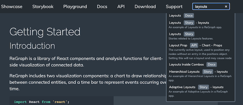
Can't upgrade right now? You can find older versions of ReGraph here.
Want to learn more about how to build your own application?
linkShape property set to 'curved' they no longer produce a type error.x and y world coordinates.
This keeps world-coordinate annotations in place even when their subjects are added, moved or removed,
or when the chart or view are changed.times property set on many chart items no longer causes performance issues.
height or width dimensions no longer causes performance issues.
data property set on open combos using the setStyle function
of the onCombineNodes event is now correctly returned by other event handlers.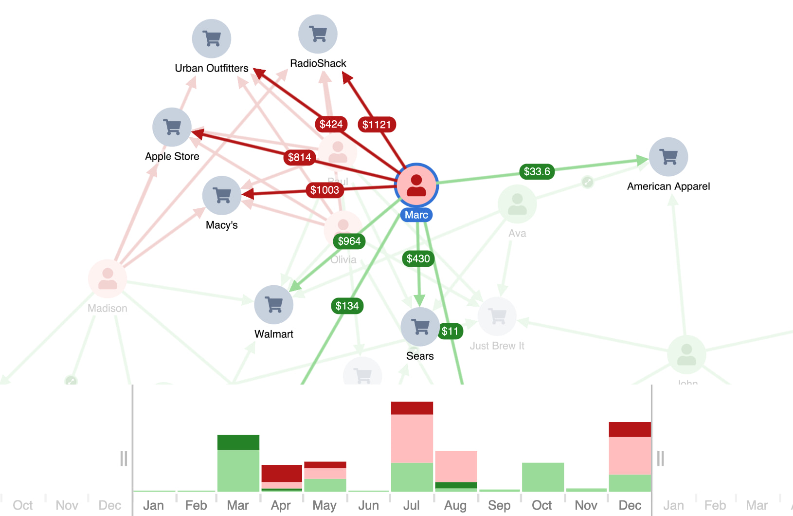
We are ending support for Windows 10 from 31 March 2026, following Microsoft ending support for Windows 10. See Supported platforms & browsers for details.
data in the setStyle function of the
onCombineLinks event now works as expected.tightness values set for nested combos are now respected.
summary and contents links for nested combos works correctly on first load.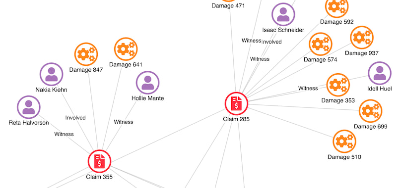
text property of fontIcon.onItemInteraction event.
FontLoader component using TypeKit's Web Font Loader
and are planning to remove the component from the ReGraph package in the future.
Use document.fonts
from the CSS Font Loading API instead.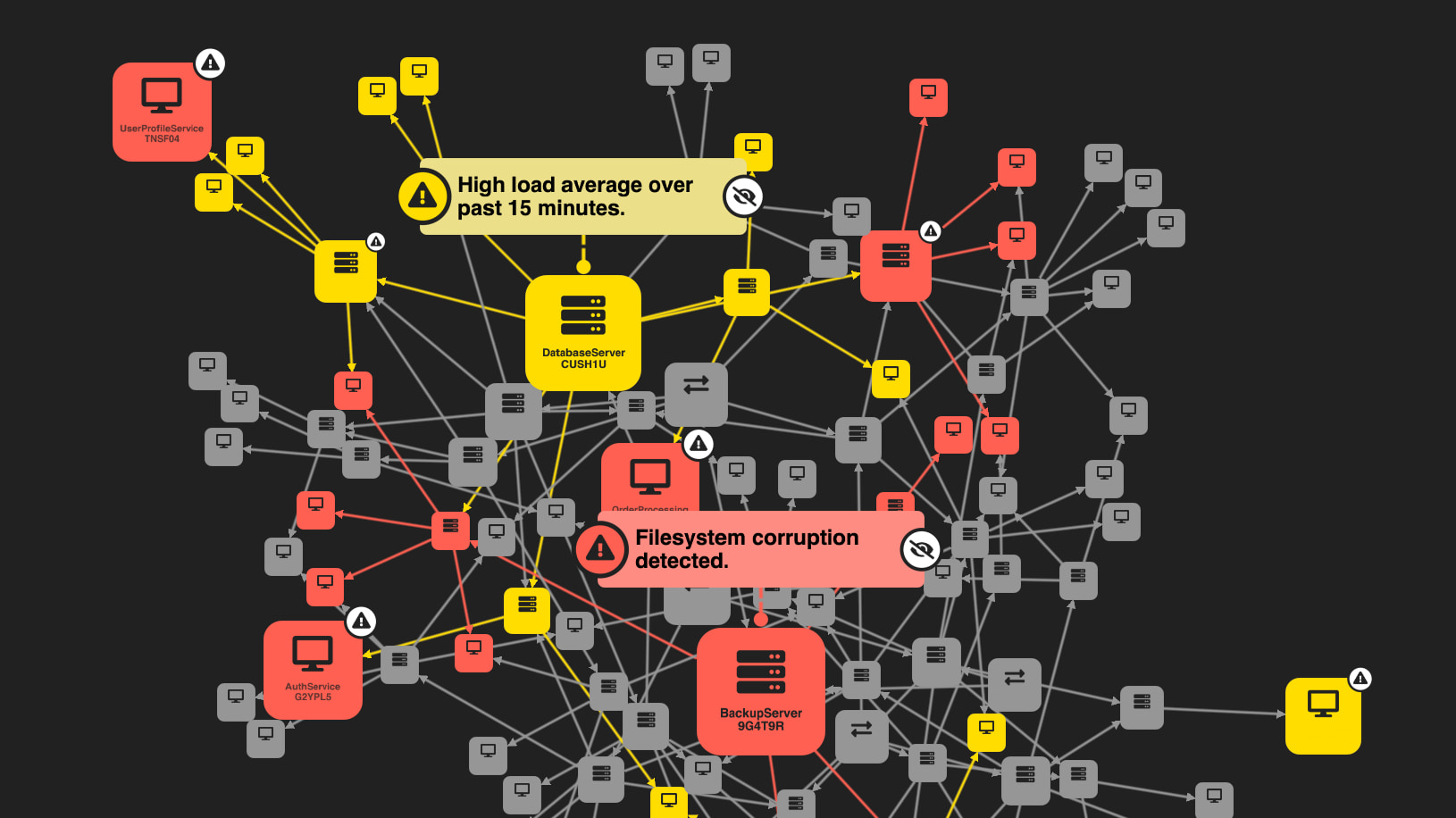
width property
to customize the border width. Explore the new API in the updated
Node Gallery and
Link Gallery, or see the
redesigned Cyber Impact
showcase with an enhanced alert system and interactive annotation glyphs.id in the onPointerMove event.
id1 and id2 properties of
onLinkAggregation
match the items at the ends of the aggregate link.
GlyphLabel now inherits from LabelBase
and not the other way around. This corrects some wrongly expected default values for the color of the labels.Label type.
Instead, it has its own WatermarkLabel definition, which inherits from Label
and overwrites some default values.In this release, we've focused on improving the way combos are animated and laid out alongside other chart items. As a result, combo animations are now smoother than ever, and combos are laid out in charts more neatly and efficiently.
Explore the improvements in our new Social Media Analysis showcase.
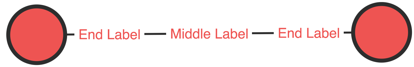
In another great improvement, you can now create even richer chart designs with our new link label styling APIs.
The border option customizes the color, width and radius of borders around your labels, while the padding option controls the distance between the label text and the label border.
For more details, see our updated Link, Link Gallery and Path Finding stories.
onChange events.
onItemInteraction
event.
minHeight set to 'stretch' are drawn correctly on auto-sized nodes and annotations.
onItemInteraction
event.
labelOffset
are now always exported as expected.
width or height set to 'auto'
now resize when the nodes change size.
animate set to false in the animation prop.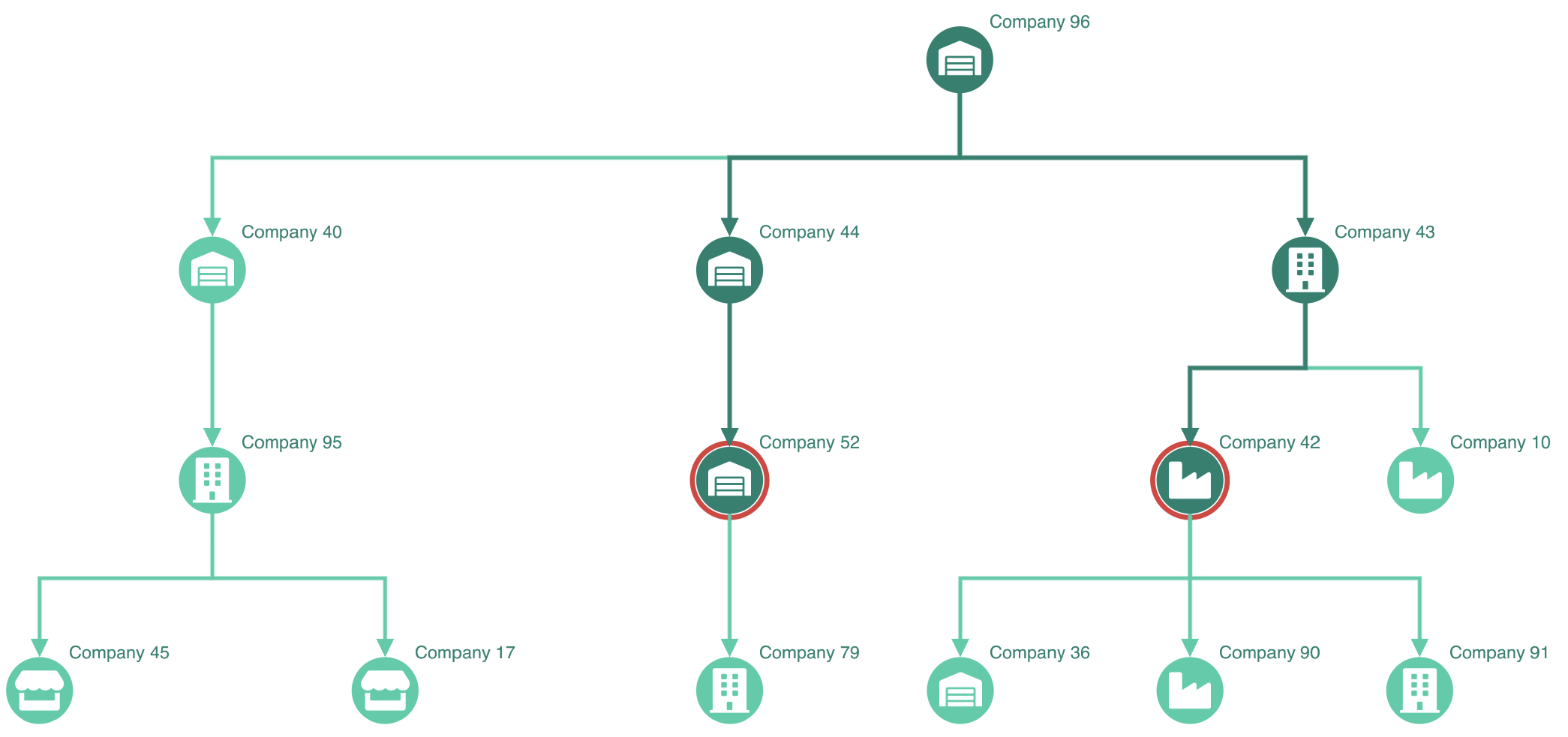
orientation property.
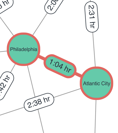
See the Angled Links story.These features are currently in beta. They are fully tested and safe to use in production, but we may still introduce breaking API changes in future versions. You can share any feedback to help us refine them by contacting us.
onItemInteraction event in various situations
such as foregrounding combos or styling items selected by marquee selection.
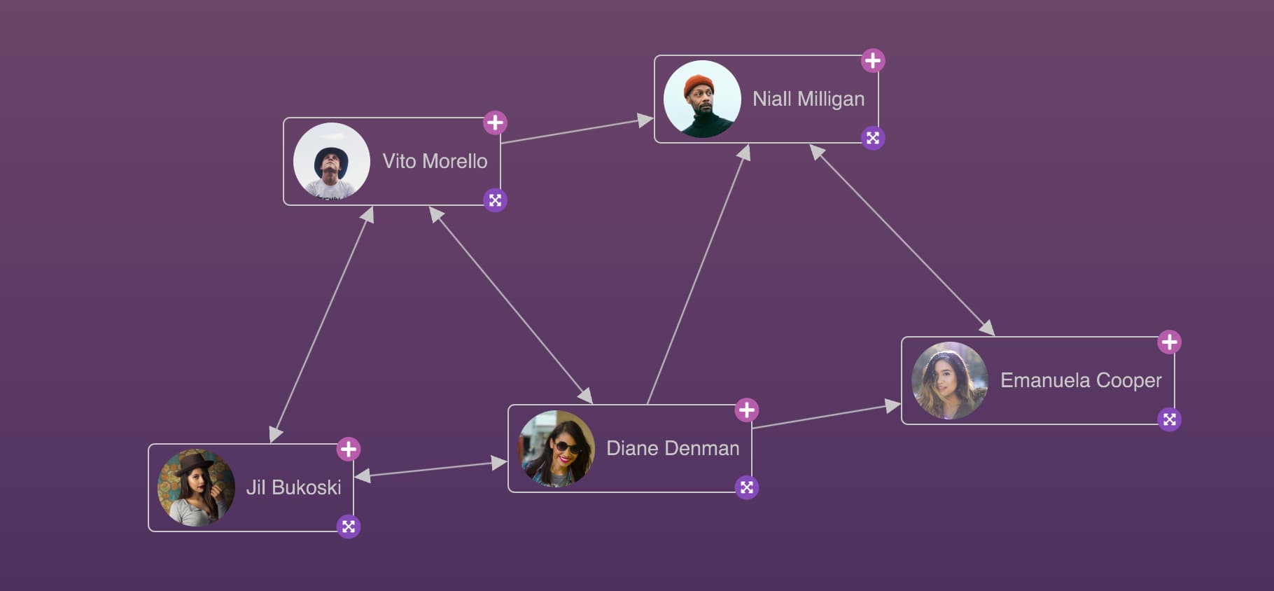
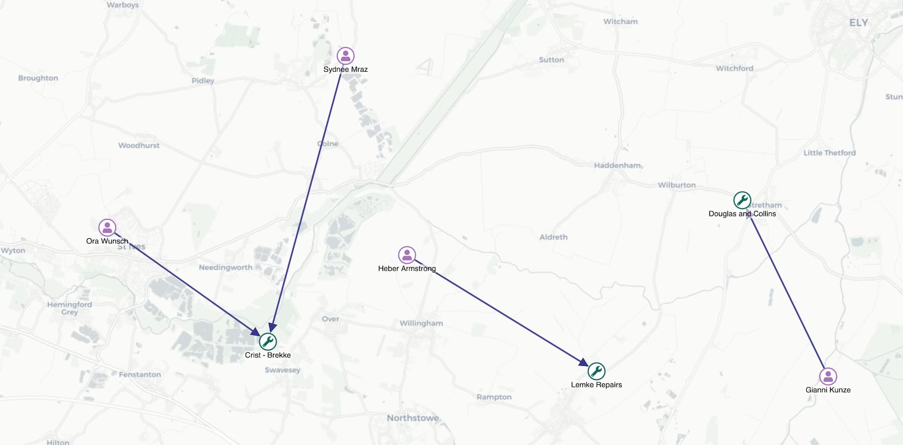
When visualizing connected data, a beautiful chart is just the beginning — the next step is to tell the story behind the data.
ReGraph annotations bring a new dimension to graph visualization, fitting seamlessly into your application and elevating your workflow.
Annotations add a narrative layer to your charts so that you can analyze, capture, discuss and share insights directly within the chart. You can annotate nodes, links and combos, and annotations will stay readable at any chart size and zoom level.
Start exploring annotations in our brand new Investigative Workflows showcase.
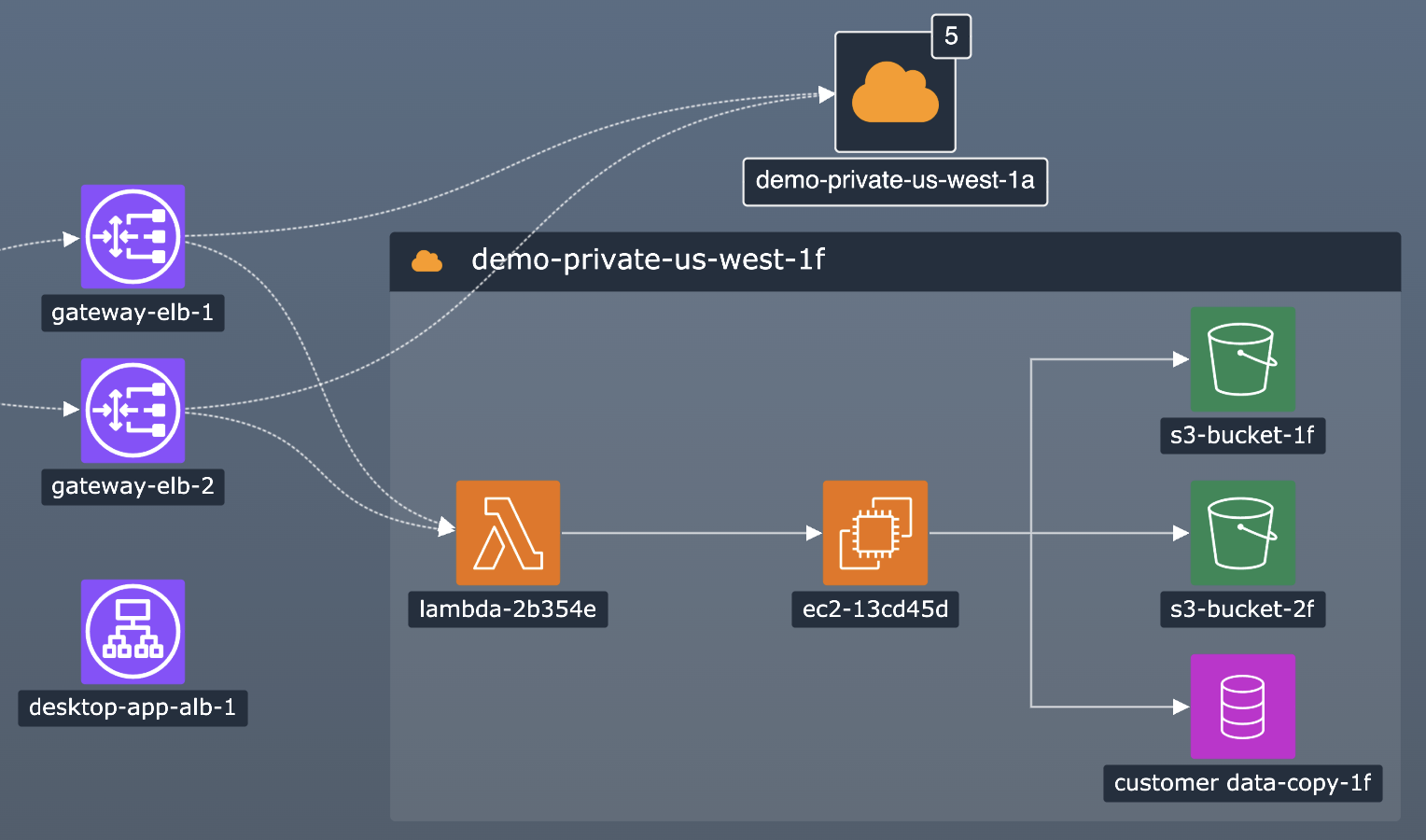
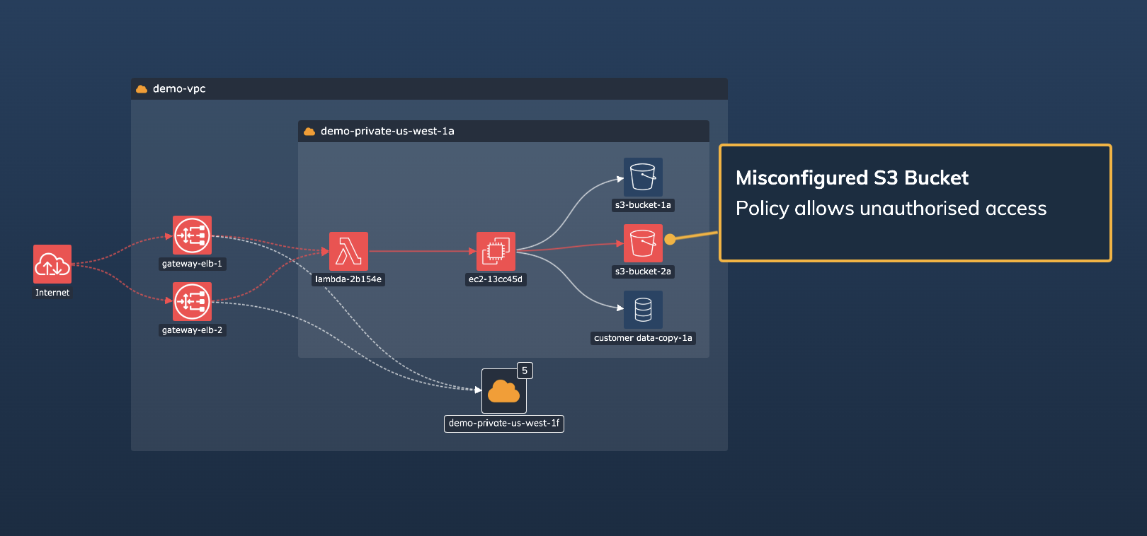
Turn AI-generated or algorithm-based alerts into annotations and highlight the most important parts of your network. Using ReGraph events, you can add interactive elements on annotations to allow your end user to deal with these alerts, creating an end‑to‑end in‑chart process for visualizing and resolving network alerts.
See an example of this in our updated Cloud Security showcase.
You can also use annotations to show real-time insights in a collaborative workflow between colleagues or investigators. The data-driven loading of annotations lets you save and then reload user-generated or user-editable insights. Once complete, export annotated charts into a shareable jpeg, svg, png or pdf format using the export function.
The Investigative Workflows showcase is an example of this create, edit and export workflow.
You have full control over the styling of annotations to create the look that suits your application design and interface.
The annotation body, styled in the annotation object, can show any content including text, images, font icons, or even simple buttons created using labels. You can also add your own controls such as editable text fields using an HTML overlay and the new labelPosition instance method.
The connector, styled in the connectorStyle object, lets you customize how annotations link to their subjects so that the connection is immediately clear to the chart users.
Explore the full range of possibilities in a new suite of annotation stories:
We've also added a new Investigative Workflows showcase where you can try out creating, editing and exporting annotations in a chart.
To get started with annotations, take a look at the new Annotations documentation.
Annotations are in beta. They are fully tested and safe to use in production, but we may still introduce breaking API changes in future versions. You can share any feedback by contacting us.
After a period of improving, testing and implementing your feedback, the following are now officially out of beta:
positions prop is now respected when positioning all items in the chart.
gridShape is now applied correctly when the combo data is loaded on first render.overview option to true without specifying its backgroundColor
now correctly defaults to the chart backgroundColor.
undefined
by default which means that it's inherited from the chart backgroundColor.
Previously the default overview background color was 'white'. To achieve the same look,
set the overview backgroundColor to 'white'.
Item interface no longer contains fade and times properties.
Instead, a new GraphItem interface extends Item
and contains fade and times properties.Node and LinkStyle interfaces now extend GraphItem.
We've deprecated ReGraph 3.10.1 (LTA), which means that from March 1, 2026, this version will no longer be available and support for this version will end.
onItemInteraction no longer incorrectly shows a fade-related warning in the console.
We've added a new Try KronoGraph page to help you learn more about KronoGraph, our timeline visualization product. The page features an intro to KronoGraph and access to a number of demos integrating KronoGraph with ReGraph:
Visit this page any time by clicking the banner on the main page.
fit instance method without changing the view
no longer fires an onChange event after interacting with the chart.
onLinkAggregation's setStyle function
no longer contains an incorrect id property
and the documentation no longer incorrectly states
that you can set a custom aggregate link id.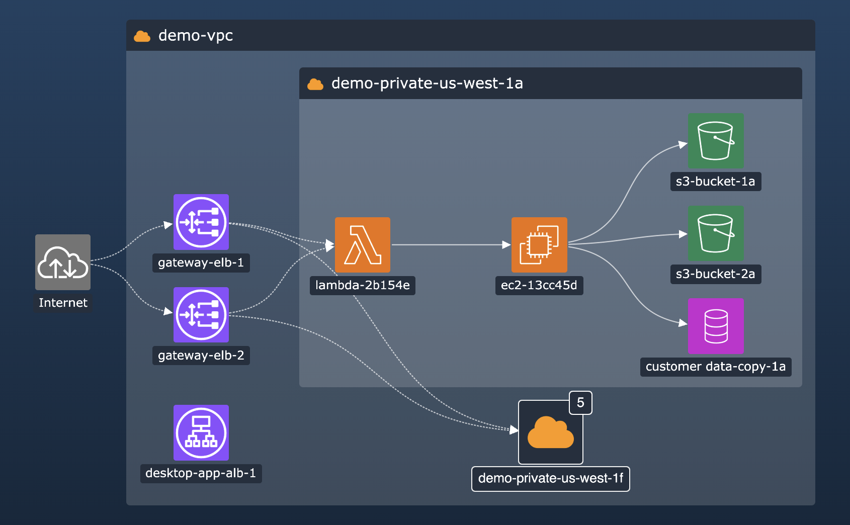
setStyle function, the sequential arrangement can help you drill down into sub-
hierarchies and explore and interpret tiered data more easily.
See more in our new
Sequential Arrange story
or in the updated Cloud Security showcase.PDFDocument.
See it in the updated PDF Report story.
style-src.onItemInteraction.
onItemInteraction
no longer causes a performance issue.
getViewCoordinatesOfItem to get information about glyphs on open combos
now works as expected.
getViewCoordinatesOfItem to get information about labels on nodes
styled with an array of label objects now works as expected.
onChange event.
onLinkAggregation event.getViewCoordinatesOfItem method to get coordinates
of nodes with a shape property now returns correct results.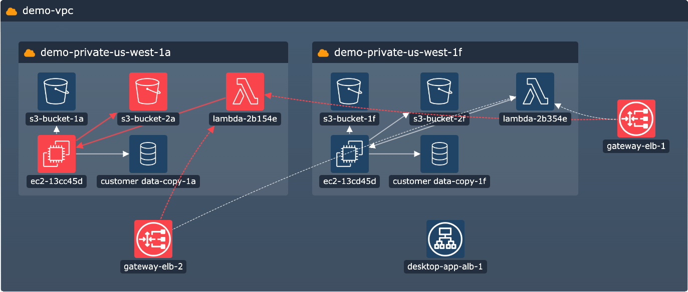
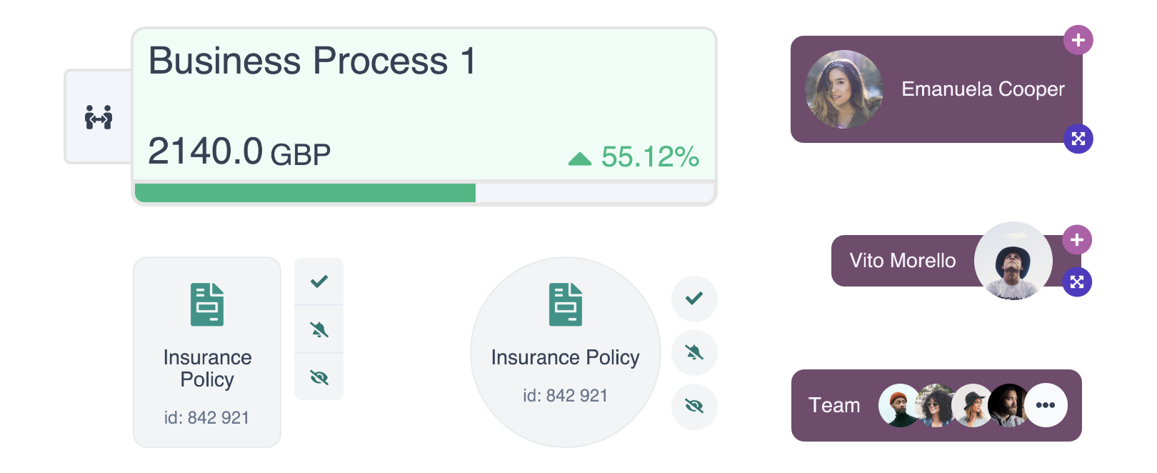
Open combos now support styling features from our 4.0 Node Styling release! Organize data in your open combos in line with your application's look and feel by using features such as multiple labels, custom label styling or pixel-perfect label positioning.
For rectangular nodes and combos, you can now set a
label to minWidth: 'stretch' or minHeight: 'stretch'
to get a bar label that fills the whole height or width of its parent and
adjusts to any parent size, which makes it great to use as a header.
In open combos, bar labels also don't get overlapped by the combo content.
In addition, open combos now support border radius to help you achieve consistent corner styling across labels, nodes, and open and closed combos alike.
And last but not least, you can now add glyphs to open combos and style and position them in the same way as glyphs on closed combos. If you style nodes or combos with both glyphs and labels, labels are drawn over glyphs by default. To reverse the order, set the new legacyGlyphAndLabelOrdering option to false.
See the new features come together in our new Network Alerts and Cloud Security showcases, or head to the Styling docs to see a new section on open combo styling.
Summarize links between the same pairs of nodes or combos with our new link aggregation feature.
Aggregate links represent their child links and visually reduce the number of connections in the chart, but still preserve all the data about the underlying links. To turn on link aggregation in your chart, set the aggregateLinks prop to true.
If you have different types of links in your chart, you can use the aggregateBy property to create more granular aggregation rules, and also set the aggregateByDirection property to take link directions into account.
Aggregate links can also be styled,
for example to provide information about the underlying links using a summary glyph
or to match your existing chart styling.
To do this, pass the styling in the setStyle function of the new
onLinkAggregation event.
To get started with link aggregation, head to the Basic Link Aggregation story or read more in our Aggregating Links docs.
onItemInteraction
is now significantly faster.
onItemInteraction to add hover styling on open combos now works as expected.worldCoordinates instance method now correctly rounds outputs.view prop fires a single onViewChange event.layout prop and undefined in the positions prop
on the same render always runs a layout.
tightness inside a combo with a concentric arrangement
no longer causes unexpected movement of child items.
tightness value of 4 or less
now produces the expected amount of space between items.
tightness lets you control
how tight or spread out the items are when they're arranged inside the open combo.
You can set it in the
arrange property
passed to the setStyle function of the onCombineNodes event.
Try it out in different combinations in the
Grid Arrange
story, and head to the
Combo Tightness
story for an example on a realistic dataset.
shape property now works as expected.
onItemInteraction to style items with images no longer
causes a brief opaque flicker.
onItemInteraction to style charts with many items containing sub-items no longer
causes a performance issue.onItemInteraction to style and unstyle a combo which was implicitly faded by setting fade: false on another item no longer produces an error.fade: false
in the setStyle function passed to the
onItemInteraction event handler
to specify which items are foregrounded during an interaction.
This new approach is both easier to use and 400% faster in terms of performance.
See how it works in the Neighbors story.orderBy property for sequential layout
now accepts a sortBy option to specify whether the order should be ascending or descending.
Try it out in the Hierarchies story.borderRadius to some existing charts
no longer makes the chart unresponsive.
view prop
now works correctly even when animate is set to false.
ReGraph 4.0 features major improvements to the customizability of nodes and node label styling.
It introduces custom-size rectangular nodes which offer even more space for information and look especially sleek in grids, with rectangular combos and with our sequential layout. You can also style them with rounded corners.
In another important enhancement, ReGraph lets you add multiple labels on a node to create information‑rich and styling‑rich nodes. Labels can truly take your node design to the next level - especially when you also use the new label styling API that lets you fine‑tune the look of your labels, use them as node styling tools or turn them into UI elements.
Our improved rectangular nodes retain the same adaptive behavior and abilities
as the default circle nodes.
To create them,
pass an object with width and height dimensions in the shape property.
You can also give them rounded corners using the node border's radius.
Get inspired in our new Cyber showcase
and in the new Detail on Zoom and
Advanced Node Gallery stories.
To add multiple labels on a node, pass the labels as an array of objects in the label property.
Each object is a label that can have a text or a fontIcon property, and that
can also contain other styling options from the label styling API.
See how it works in the
Advanced Node Gallery
or in the updated Node Gallery story.
With the new node label styling API, you can do things like:
position property.margin and padding properties.textWrap property.fontSize set to 'auto'.minHeight, maxHeight, minWidth and maxWidth of labels.See also the Node Gallery story, Node Label API and the Advanced Node Styling docs.
With an unlimited number of labels come unlimited possibilities. As well as a source of information, here are some other examples of use:
backgroundColor used as color blocks)data properties)onClick and onItemInteraction events)Multiple labels and label styling are straightforward to use
whether you're starting from scratch or updating existing code.
To enable unlock the new APIs,
place your existing label or font icon inside a label property array of objects, for example:
label: [
  { text: 'label' },
  { fontIcon: { text: '☺︎' } }
]
Note that multiple labels API and label styling API are currently in beta. You can share any feedback by contacting us.
data is no longer deep cloned
when the property is imported to the chart model or retrieved from it.width property to 0 no longer removes the border of the open combo.
data property object every time
the property is imported to the chart model or retrieved from it.
This affects all functions that accept or retrieve the property.
To restore the previous behaviour,
deep clone the data property object before passing it to ReGraph.
Items in the View chart
prop now correctly raises a TypeScript error.
image, export,
viewCoordinates and worldCoordinates chart instance methods.
center option.
Use the position option instead.
packing set to 'aligned' now always produces the expected result.selection in the chart options prop to false no longer causes TypeScript errors.velocity decreases the level of CPU usage as expected.FontLoader component now works correctly in React 18 dev mode.gridShape option lets you control the number of rows or columns inside open combos
with grid arrangement.
Try it out in our new Grid Arrange
story.
packing set to 'aligned' always produces the expected result.ping instance method no longer causes TypeScript errors.onUpdateComplete event
is invoked each time the chart has finished updating. You can use it for example to check
when the chart animation is complete. Note that the event is currently in beta.getItemAtViewCoordinates, getItemInfo and getViewCoordinatesOfItem.
See our new Testing tips docs for details.
Note that these methods are in alpha, which means that we might change their behavior
or introduce breaking changes in any release until the alpha status is removed.You can share any feedback about our alpha or beta features by contacting us.
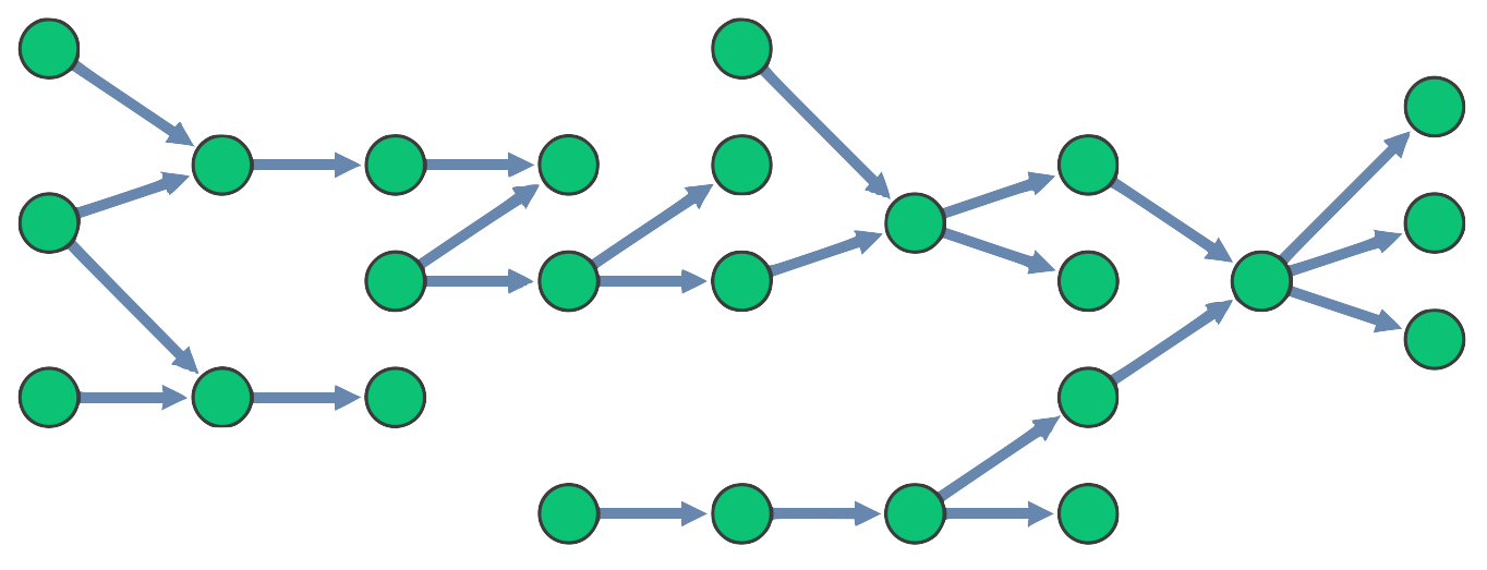
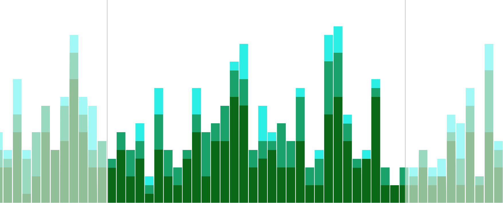
The main theme of this release is a number of new features and improvements for our sequential layout:
stacking property. Setting its arrange option stacks groups of four or more
same-level nodes with identical neighbors into grids that make even wide hierarchies
readable without any zooming.packing option to pack them like any other layout to
make the most of the available screen space.stacking and packing options on a sequential layout,
we've added a brand new
Navigating Large Hierarchies
story.orderBy property lets you order the nodes within levels
based on a value of a specified data property. See an example in our
updated Hierarchies story.Note: If you are setting packing for all your layouts,
the setting will now also be applied to sequential.
If you want to keep the previous behavior, set packing
to 'aligned' for sequential layout.
contents property that shows or hides summary link's contents
now accepts a dictionary with ids and truthy values
for the child links that should be revealed. Try it out
in the updated Summary Links and Selection Behavior story.
ping instance method are correctly typed as optional.color property for label is now correctly typed.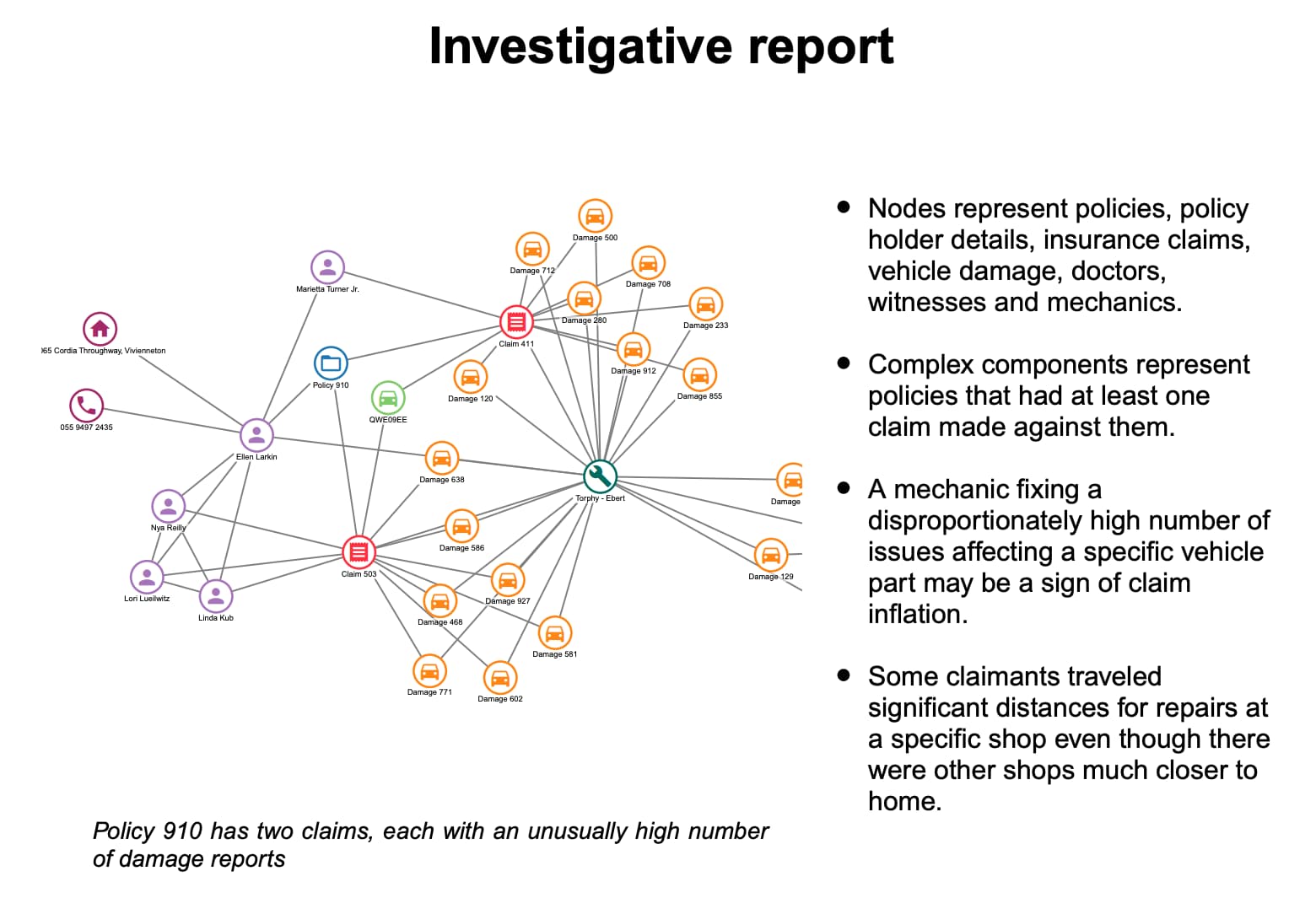
Present, share or publish your charts as PDF documents in just a few steps
- ReGraph's export method can now be set to type:'pdf'
to generate images of charts in the popular format.
You can customize the output using the doc property
by passing your own PDFDocument from
PDFKit.
extents option specifies
whether the whole chart or just its on‑screen view should be exported.export instance method is still in beta and you can share any feedback by
contacting us.Note: As stated in the Dependencies page of our SDK site, the optional functionalities of PDF export and map mode require the use of open source dependencies.
options prop
can be set to 'dark' to turn the navigation and overview window controls into a dark mode.
Check out the new look in the Dark mode story.closedStyle when interacting with open combos.closedStyle are respected even for automatically closed combos.fade property is now always respected when combos are created.fit:'auto' option.center to null now shows the label correctly in the default position.angle property, the index of the sub-item is now always reported correctly.onItemInteraction event unlocks a variety of hover and selection styling possibilities.
You can style the items in the event's handler
and the styling will only apply during the specified interaction.Note: onItemInteraction is currently in Alpha, so we don’t recommend using it in production just yet.
We might change the behavior or introduce breaking API changes in any release until the Alpha status is removed. There are several scenarios when styling combos and sub-items which will be improved in an upcoming release.
positions prop now always runs a full layout.onViewChange event with correct properties.neighbors analysis with a dataset containing self-links no longer produces an error.end1 and end2 properties no longer prevents item style updates.option settings in smooth mode. export instance method generates
a high resolution .png, .jpg, or .svg image of the chart.
Check out the updated Export story
or try it out on a huge chart in the Performance showcase.range in the onChange event when relevant.view prop is correctly reported in onChange when the chart is passed positions on first load.handMode: false is respected when the chart changes to map mode.dummyLink dragger now works correctly in map mode.items now appear immediately if assigned coordinates while in map mode.viewCoordinates and worldCoordinates no longer cause TypeScript errors.onViewChange now fires consistently on first load.ReGraph version 3 brings you a brand new events API that is more powerful, intuitive and more customizable than ever before.
While you can continue using the deprecated legacy events during the lifecycle of 3.X, we strongly recommend migrating your code as soon as possible to make the most of the new features.
ReGraph doesn't support simultaneous use of legacy and new events. Having both event types in your code will result in errors.
preventDefault() to prevent default actions.
Also, error handling is now done directly in the event handlers.
setDragOptions() function and properties such as button and modifierKeys,
you can customize the dragging behavior to respond to various user actions such as key or button presses.Using any ReGraph events (legacy or 3.0) simultaneously with native React DOM events is not possible unless the React DOM event is moved onto a wrapping div.
We've removed support for the following APIs:
view API for legacy onTimeBarChange event. Use range instead.consistent property on the layout prop is now handled internally by ReGraph.setStyle. See Styling.
We've also removed support for some previously deprecated APIs. See Breaking Changes.
positions prop input validation has been improved.
Our new rectangular combos provide a clear and condensed view of your data and its context. They also work particularly well with our sequential layout! Here are the technical details:
shape property which supports 'circle' and 'rectangle'. arrange property. It is the default arrangement for rectangular combos.You can try out rectangular combos for yourself in our
Rectangular Combos story,
or open any of our other combos stories in the playground and add shape:'rectangle' to the combine prop.
Please note: rectangular combos are in Alpha, so we don’t recommend using them in production just yet. We might still introduce breaking API changes, or change the behaviors or animations in any release until the Alpha status is removed.
We are very keen to hear from users who want to use rectangular combos. Please tell us about your experience with them by emailing [email protected].
properties array in the combine prop are correct in the data objects of their nodes.dummyLink drag return now works correctly with curved links. onChartDragCancel was not firing in some circumstances.value on the times property of items has been corrected to number.fit:'auto' have been improved.curvedLinks property for styling the links of sequential layouts.
When set to true, links join nodes in the direction of the orientation property.
Check out the updated Hierarchies and
Impact Analysis stories.dummyLink API returned from onChartDragStart which triggers a dummy link dragger and lets the user create a new link. See the updated
Create Link story and the Breaking Changes section for more information.top property in the layout prop. consistent property of the
layout prop has been deprecated as most of its functionality is now handled internally by ReGraph.
The selection workaround previously used in the Create Link story no longer works. The story now uses the new dummyLink API. If your app gives your users the ability
to create links by dragging between nodes, you will likely need to update your code.
For any help migrating to the new format, please contact support.
fit:'auto' was not fitting properly when items were added to an empty map.fit property is respected when the Chart is initialized.fit:'auto' is set.null or undefined.onChartClick event now passes the subItem property when clicking on a combo.fit:'auto' is set.data: { group: 0 }.In ReGraph 2.0 the chart is better than ever at adapting to changes in your data and state. Adaptive layout and view strategies automatically tell the story of your data and keep your users informed.
For help upgrading from ReGraph v1.X, see the Version 2 Migration Guide.
Layouts have been improved to be more adaptive. Components will arrange themselves more intelligently when adding or removing items from the Chart.
ReGraph uses adaptive layouts so long as the positions prop is unset.
No extra layout prop options are required.
Read more about Adaptive Layouts in the Cambridge Intelligence blog.
We've changed the way that ReGraph handles the view. By default, we'll maximize the visibility of changes to the Chart, while minimizing the amount the view moves. This helps keep the user informed as they manipulate the state of the chart.
A new fit option lets you control this behavior, or switch it off entirely if you want to ensure the viewport won't move.
In addition, we've introduced a new set of instance methods for the Chart and Time Bar which allow direct manipulation of the view.
As a result of these changes, the String values in the view prop for the Chart have been deprecated.
The Time Bar view prop has been deprecated entirely.
stretch option for the sequential layout to adjust the spacing between levels. Check out the updated Hierarchies Story.times object on items is now typed properly.range prop now uses the expected start and end values.highlight prop now handles time ranges correctly. onChartDragStart event no longer triggers when a drag starts on a link. <Chart items={ '': { color: 'red' }})
For details on how to handle the following breaking changes, see the Version 2 Migration Guide.
name in the layout prop is now 'organic'.packing in the layout prop is now 'circle'.range prop now uses the expected start and end properties, not dt1 and dt2.times object on items has been updated to accept a Date, number, or object containing start and end.'hierarchy' layout is now deprecated. Instead, please use: layout={{name: 'sequential'}}
view prop are now deprecated. Please use the new zoom, pan, and fit instance methods instead. view prop is now deprecated. Please use the range prop and the new zoom, pan, and fit instance methods instead. ReGraph version 2 has a number of improvements to reduce the complexity of your code in key areas, such as the layout and view props.
ReGraph's default layout options have changed to:
layout={{name:'organic', packing:'circle'}}
We believe that these options provide the best experience, but if you want things to look as they did by default in version 1, then use:
layout={{name:'standard', packing:'rectangle'}}
When using packing:'rectangle', or setting the positions prop you will not get the new adaptive layout behaviors.
The 'hierarchy' layout has been deprecated. Please use our next-generation hierarchical layout 'sequential' instead.
The options prop has a new fit property which by default automatically adjusts the viewport to show your users the changing data in the chart. It massively simplifies how the viewport is managed and in many applications it should remove the need for you to set the view prop entirely.
We recommend removing the view prop in the render function of your application and running some regression testing to see whether the fit option handles things sufficiently. We'd be happy to talk through any cases where you still need to control the view on [email protected].
To make manual viewport adjustments more robust, we have replaced the string value view properties with zoom, pan, and fit instance methods. You will want to use these instance methods if you still need to pass a string value to the view prop.
You can continue to use the deprecated view prop to preserve existing behavior.
The view prop has been deprecated in favor of the updated range prop. There are also new zoom, pan, and fit instance methods to make manual viewport adjustments more robust. You will want to use these instance methods if you were passing a string value to the view prop.
Additionally, the format for the times property on items has been updated to accept a Date, number, or object containing start and end. This prevents the situation where a times value could contain both a point in time and a duration.
sequential layout, meaning the top and level options are now optional when using this layout. fade nodes instead of removing them. options.selection and falsey values.sub argument.onChartDragCancel event invoked when a state change animation cancels a drag.onChartDragCancel event, above. sub argument on event handlers has been deprecated in favor of subItem.mode prop to 'smooth'. See the Time Bar documentation and Smooth Mode example.<Chart items={ '': { color: 'red' }}) />
histogram has been deprecated in favor of style. Instead of:<TimeBar items={items} options={ histogram: { color: 'red' } } />you should now write:<TimeBar items={items} options={ style: { color: 'red' } } />Note: histogram will continue to function until the next major version of ReGraph.mode prop. The following changes may break existing code:TimeBar.HistogramOptions has been renamed to TimeBar.StyleOptions.histo value for TimeBar.EventTypes has been removed. This affects the first argument of time bar event handlers.times property on items is now correctly typed. Check the API for more details.highlight prop is now correctly typed. Check the API for more details.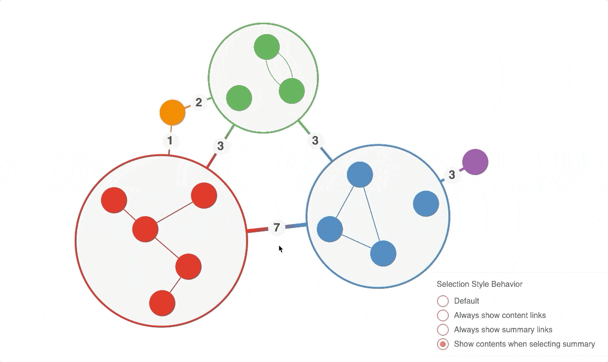
To respond to state updates more quickly, we've increased the strictness of our change detection algorithm. This means that sub-objects on items must be re-created when modified.
If you have code that mutates these sub-objects, like this:
const item = { ...items[id] };
item.label.color = 'red';
You will now need to rebuild those objects, like this:
const item = { ...items[id] };
item.label = {
    ...item.label,
    color: 'red',
};
This release has one breaking change in the analysis namespace: shortestPath return values 'one' and 'onePath' now return an ordered array of ids along the path.
The Cambridge Intelligence Figma Design Kit is a powerful new tool to accelerate the design and build of beautiful, branded graph and timeline visualizations that seamlessly fit into your application UI. It aligns with our product feature sets and APIs, ensuring a faster and smoother Design-to-Development handover.
To use the Figma Design Kit, download it, and then either drag the .fig file, or import it, into your Figma project(s).
We always recommend using the most recent version of ReGraph, as it includes the latest features, enhancements and performance optimisations. Every release is stable and suitable for production use. We understand that you might not be able to do this right away, especially if it means upgrading to a new major version.
If you’d prefer to continue using a previous major version, you can download a ReGraph Long Term Availability (LTA) release.
With each major release we will make an LTA release of the previous minor release available. We’ll always provide at least 12 months notice when we intend to remove an older LTA version.
If you’re using an LTA release, you’ll get the same high level of support from ReGraph developers. We can't retrofit bug fixes in an LTA release, but if you find an issue, please report it to [email protected].